Make your design system content-friendly
Design systems provide many benefits. But they can make unrealistic assumptions about how content will be presented. How content-friendly is your design system?
Written by Michael Andrews

Design systems provide many benefits. But they can make unrealistic assumptions about how content will be presented. How content-friendly is your design system?
Written by Michael Andrews

Design systems are now widely used in enterprise design operations. Much of their emphasis has been on improving the productivity of screen development by providing reusable UI components. Yet design systems are more than a productivity tool.
More mature design systems will guide how the user experience is constructed. To provide that guidance, design systems need to engage with content requirements.
“If they are to scale, persist, and gain enough resource to evolve, design systems need to include content,” notes the content strategist Kate Kenyon.
Design systems provide rules for how to present content. But content often gets limited emphasis in design systems.
Some organizations include content guidance in their design systems. They may incorporate style guidelines that provide word lists, voice and tone guidance, and sample microcopy patterns to follow. While part of the design system, the content section will be created by writers for other writers to use. It furnishes general writing advice that applies to all interface copy—and is not specific to individual UI components. The style guidelines are organizationally separate from specifications about UI components.
This discussion, in contrast, will look more at the UI components and how they should provide guidance to content creators. In particular, we’ll explore what designers need to tell authors about UI components.
Design systems make the content structure visible. Brad Frost, who developed the concept of “atomic design,” argues that “a well-crafted design system caters to the content that lives inside it.” He talks about “visualizing the content skeleton.” What’s significant about his statement is its emphasis on the role of structure. Design components have a structure. And content has a structure too.
Structure is necessary to provide consistency. Peter Zogas at Autodesk notes: “Content and microcopy appear all over design system components. Without an effort to standardize early, you’ll end up making decisions about how copy should appear each time you implement a component.”
Design systems can promote the reusability of content. This benefit is often underappreciated.
When people can see the different ways that content can be displayed, they are more prone to utilize that content in different scenarios. They will see where the same heading or image could appear.
Reusing copy gives you more control. You can reuse content elements from your headless CMS’s content model in different design components. For example, a heading might show up in a promotion or a list. Teams can stop recreating text (or manually copying it) and will gain consistency by doing so. Reuse makes it easier to manage many dimensions of UI copy:
Many design systems are incomplete. They primarily focus on creating a design language and some simple patterns. Emmet Connolly at Intercom says: “Most Pattern Libraries take the form of a web page that lists the different styles of all your UI elements.” He adds: “There are a few problems with pattern libraries. Yes, they allow you to keep all of the smallest elements consistent. But they don’t have an opinion about how they should be put together.”
What’s missing from many design systems is attention to larger, more complex components that will present—and coordinate—multiple content elements.
Design systems are often weak at articulating details about components that are content-intensive. Many focus entirely on styling and are agnostic about what content they will present.
A handful of design elements, such as the hamburger menu icon, are completely symbolic. But most design components convey no meaning without content.

Design system components exist to present content. When we take away the content from even a familiar design component, we don’t know how it is supposed to work. We can deduce the presence of numerous instructions and links. But what they mean is a mystery.
Look at the ratio of pixels devoted to text compared with graphics. When there’s a lot of text, it’s a strong signal that the content will be critical.
Design system components have an “anatomy” that provides a consistent structure for presenting the content in a specific scenario. They will prioritize the content elements that users view and interact with.
UI components should answer:
Cards are one of the most common design components. They are highly flexible, able to present a wide range of content types. But their ubiquity also can make them hard for users to decipher. They make the content look tidy but also seem homogenous. Sometimes they mask important differences concerning the content’s role.
Cards need to pack a lot of meaning into a small space. Nathan Curtis of EightShapes notes that: “More than just a generic container, a card is a scannable snapshot of an object’s vitals. It previews enough to identify. It invites us to learn more and interact, in that order.” He asks: “What happens to a card if required elements are missing?”
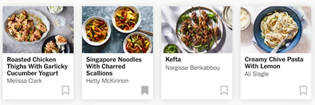
The New York Times’s popular cooking app illustrates the importance of aligning content types and design components. My family uses this app extensively. Like many apps, it relies on cards to present a range of content types.
Jayne Lee, a product designer on the NYT Cooking team, writes: “Our cards provide an abbreviated look into the content, whether it is a recipe, a collection or a guide. These three content types are fundamentally different, so we made them visually distinct.”


A recipe, collection, and guide are distinct objects with different purposes. But when presented in cards, they are only subtly different in appearance—perhaps too subtle for new or casual users to notice. The sameness of the card layout has overwhelmed the slight differences in the cards. Perhaps the differences would be more explicit and easier-to-notice with additional content elements, instead of relying solely on visual styling to differentiate content types.
The app also highlights the challenges of creating design systems after the content has already been created. Design components must try to adapt to the content, which may not be as predictable as would be ideal.
Lee states: “We have strict rules about how our content is displayed. The hierarchy of the content on a card is: image, title, byline, action. Our recipes can have long titles that break into multiple lines of text, and they can have long or double bylines. I tried to display as much content on our cards as possible by slightly enlarging the card containers.” Her comment highlights the problems that can surface when retrofitting a design system to existing content that lacked governance. If the image is more important than the text, it could mean that some text could be cut off.
A common weakness of many design systems is that they will talk about a generic “content block” without getting into details about how the content will appear.
All text is not the same: it can be presented in many ways. The design system should specify how the text should be presented—and by extension, what authors need to write so that the text works.
Text has properties such as length and formatting. Text expresses messages that have a focus. These factors influence the readability of text messages. Design systems need to make optimal use of available space to promote the right emphasis and enhance message clarity.
At a basic level, messages can involve either short or long text. But even these distinctions can be further elaborated.
Scroll horizontally to see more →
The properties of the copy will influence its presentation. Authors should have some standards to work with so that the copy matches how it gets presented.
Scroll horizontally to see more →
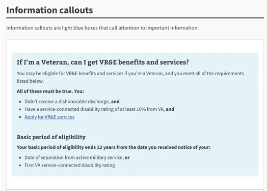
We can see how text can be presented in an information callout from the Veterans Administration’s design system. The example features real text that shows how the copy is formatted using bullets, headings, and bolding.

Design systems address different levels of detail. At every level, the content presented will influence how effective the experience is for users.
The most basic structures in a design system are individual elements, what Brad Frost calls atoms. They are sometimes referred to as “base” components or “primitives” because they are inputs into other components.
Content in atoms identifies what something is or what to do. Some examples of elements include:
The design systems should specify when the content presentation will be consistent and when variations are possible. Images, for example, can be formatted in various ways. The design system should specify guidelines for authors and any limitations concerning how the presentation will influence the content. For example, it can provide rules about when text should appear within a button as opposed to being presented as a link.
Simple components (“molecules” in Brad Frost’s classification) will present more than one content element. Already, the coordination between elements becomes important.
Simple components can convey important messages, especially relating to actions. Some simple components that present important content include:
The content that’s presented in simple components will influence task dropout or uptake. Since this content is meant to attract attention and action, it’s important to clearly convey its purpose to users. Some of these components will interrupt the user. The message presented and the component’s behavior need to be aligned.
The design systems should clarify the expected role of various components that may appear similar. Consider how components may need to appear in the context of a user journey scenario. Messages about errors or problems requiring attention will not necessarily have the same characteristics. They could be a payment error and a login error or occur as part of an onboarding or renewal process. These factors could influence how messages should be presented.
The design system should give authors confidence that an appropriate design component will present key messages so they can optimize content to work within its presentational parameters.
Complex components are layouts that support a more complex message. These are often content-intensive but not robustly defined in the design system.
These components often included mixed elements: text, images, and functional controls. The relationship between these elements will create a message hierarchy that will influence a user’s choice of action or pathway.
Some complex components include:
The Veterans Administration design system highlights the complex structure that can be associated with a feedback message. The message could involve sub-conditions, as well as a need to provide users with different options concerning their next actions. Authors should know how to structure this content so that it can be presented effectively within this design component.

Shells provide a high-level layout or organization for presenting other components. They specify patterns for presenting multiple items, which can be related (of the same content type) or complementary (a mix of content types). This part of the design system influences the visibility and importance assigned to specific content that’s presented.
Some examples of design shells include:
While some layouts are related to static pages, many will feature interactive design elements that reveal or de-emphasize different content elements.
Layouts will reflect their role or purpose, framing the context for the channel and the journey involved. Layouts can indicate how to present the content structured by container content types.
Shells allow individual items to be swapped in and out in a predictable way.
In the case of screen layouts, teams may use eye tracking to test what users notice and find. Since a layout will be independent of specific content, it can be tested with a range of content to assess its effectiveness.
For newer channels such as AR and voice bots, the design system should explain interaction behavior so that authors know how content will be presented to users on each platform and what cues the content must provide to support effective navigation and action.
Building a design system is a long-term initiative. While many organizations have the core of a design system in place, they still have many opportunities to expand and enrich it. Extend your current system by developing standards relating to more complex user scenarios and the growing range of non-browser channels.
Remember: headless content can be delivered to many endpoints. Authors want predictability in how their content will be presented. Having such predictability will allow them to develop more effective content.
Authors and other content creators are users of the design system just as much as front-end developers are. Authors shouldn’t only be adding their own material to the design system documentation. They need to be able to use documentation that designers have created.
An effective design system will provide authors and content creators confidence that what they develop will be right for the user. They won’t hear about any unpleasant surprises, such as truncated content or content hidden from view.
Develop a checklist to review your design system. The core promise of a design system is the reusability of UI components. Make sure your system has the right UI components available and that they will be used correctly. Keep in mind the following:
These enhancements won’t just make content colleagues happy. They will improve how your design system supports user needs.

What if we told you there was a way to make your website a place that will always be relevant, no matter the season or the year? Two words—evergreen content. What does evergreen mean in marketing, and how do you make evergreen content? Let’s dive into it.
Lucie Simonova

How can you create a cohesive experience for customers no matter what channel they’re on or what device they’re using? The answer is going omnichannel.
Zaneta Styblova

To structure a blog post, start with a strong headline, write a clear introduction, and break content into short paragraphs. Use descriptive subheadings, add visuals, and format for easy scanning. Don’t forget about linking and filling out the metadata. Want to go into more detail? Dive into this blog.
Lucie Simonova