Scale your experience: Connecting content and design modules
Digital teams want greater flexibility in how they deliver experiences. But without proper coordination, flexibility can be hard to scale. How should teams coordinate the growing diversity in their content and designs?
Both content and design are becoming modular by utilizing reusable structures.
Modular content structures how information and messages are created and managed.
Modular design structures how information and messages are presented.
The content and design are decoupled: they are independent.
The content is structured by a content model that consists of content types composed of content elements.
The design is structured by a design system of reusable UI components, layouts, and patterns (which we’ll collectively refer to as design components.)
But if content and design are decoupled, how can we get them to work together? Teams need to map the relationship between them.
Mapping involves associating the content’s framework with the UI framework. For example, when you have the name of a store location, how does that name get presented in the UI? It could be shown in a list of locations or on a map.
Start with the basics. The easiest way to understand the relationships between content and design is by showing simple content types and simple design components. Once we cover some basic cases, we can look at more elaborate ones in future posts. This approach can scale up or down in complexity. Teams can use the approach to associate text labels with specific design elements. Or they can use it to associate a complex content structure such as detailed product descriptions with design layouts presenting that information.
Let’s first talk about design systems—and why they can be a mystery to content creators.
What does a design component need to tell us?
Design systems shape how content is presented. But sometimes design systems aren’t very good at telling us what they are trying to do.
Design components in design systems can specify many attributes of elements. It will commonly indicate:
The kind of media displayed (text, images, video, chart)
Layout and positioning of elements
Colors and sizing
Behaviors, such as transitions and animations
All these attributes are important. But they don’t help authors much.
What design systems rarely indicate is the nature of the content it is displaying. We have no idea what sort of content will appear. Instead, the design system tells us “Here’s a button: insert some text on the button that uses this size font.”
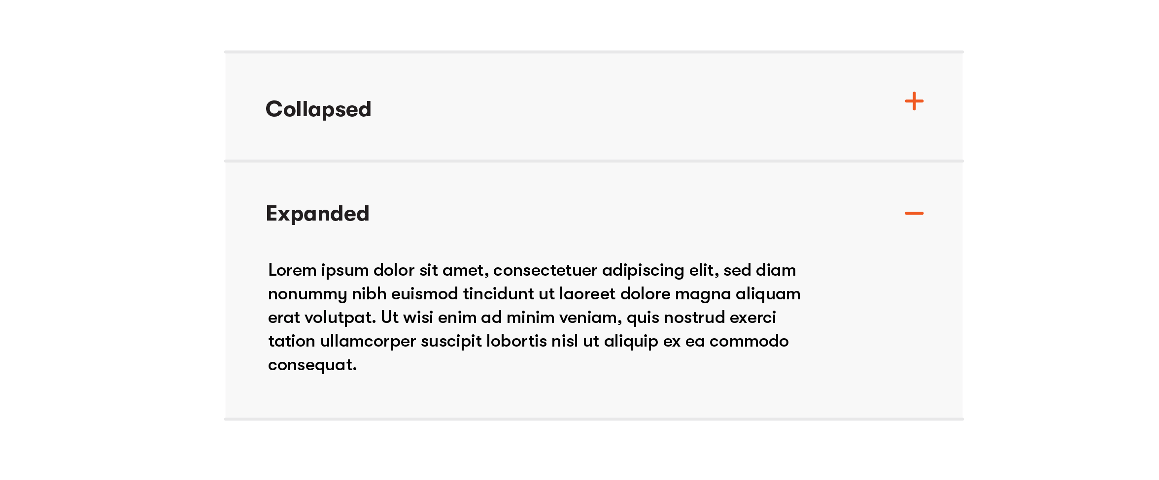
Let’s look at a component from a well-known design system used by a Fortune 100 firm.
An accordion component from the design system of a Fortune 100 firm (redrawn)
This component doesn’t tell us much about how to use the accordion.
What tasks does it support?
When is an accordion the best option?
Why hide the information in the expansion panel?
It looks like you can put any kind of text you want into the accordion—is that a good idea?
Beware of the problems of a content-agnostic design system. This kind of design system is largely a collection of empty containers ready for some content of unknown provenance. It appears as if any content can work with any component. But when you think about it, that isn’t true.
Yes, design systems need to be flexible enough to work with many kinds of content. But they shouldn’t:
Be so abstract and ambiguous that they generate questions during detailed design concerning how they should be used.
Be so focused on “atomic” level presentational issues that they fail to address the actual tasks facing users.
Leave authors wondering if their content will be usable when presented to users.
Fortunately, some enterprise design systems are becoming more specific. They provide greater detail about how different content elements need to convey messages and support tasks. A useful design system will communicate the purpose of each component and the individual elements within the component.
To enable teams to reuse content and design components successfully while keeping them decoupled and flexible, they need to understand two key questions:
Where does the information displayed in components come from?
Where does the information structured in content types end up being displayed?
Where does the information shown in a component come from?
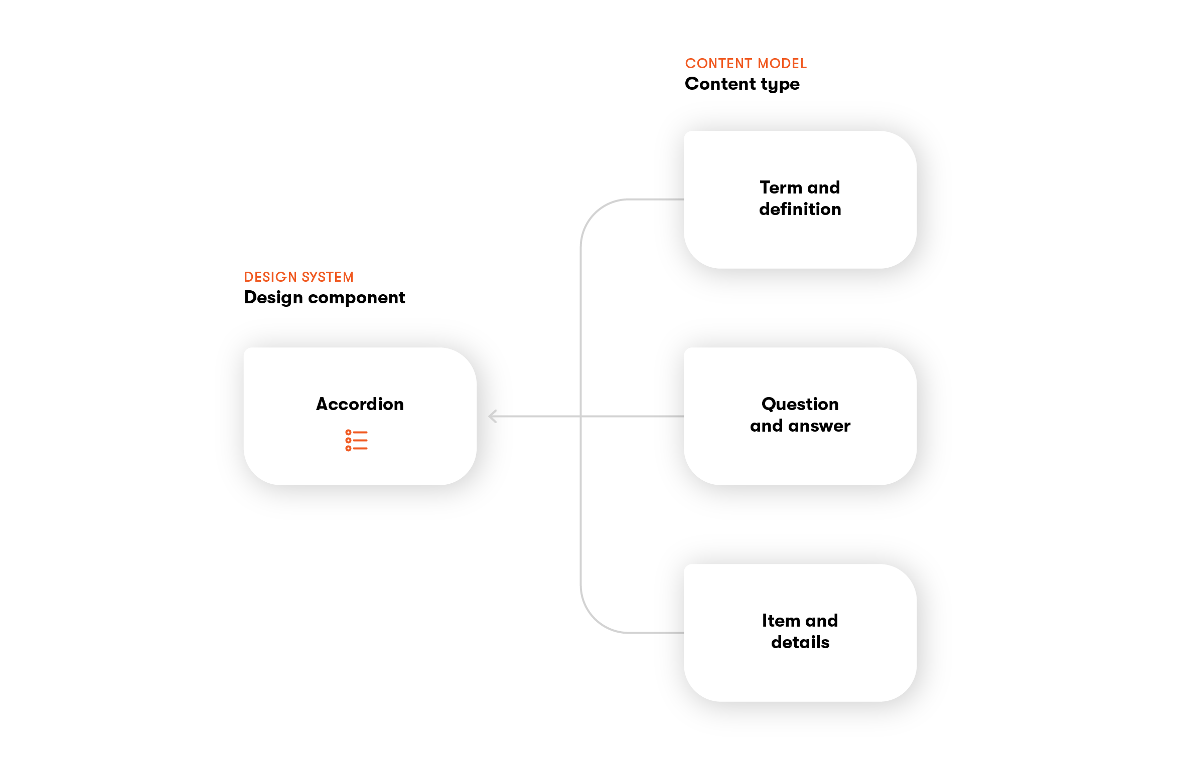
Let’s think about the purpose of the accordion. What kinds of content will appear in the accordion? There is no single answer.
Help the whole team understand which content types and elements can connect to which design components.
The most common content type to display in an accordion is a question-and-answer (Q&A).
Accordions can also display terms and definitions. These are common when you need to explain what you mean by a certain phrase. For example, a health insurance company might define important phases such as “in-network” or “authorized procedure.”
Accordions can also present named items followed by details relating to that item. It might show a list of credit card transactions, followed by the details of each transaction.
A design component such as an accordion can accept content from many content types
In short, accordions are useful when presenting items that require elaboration. Accordions support the scanning of headings without forcing users to look at the details associated with all the items. An accordion can help users scan many items without having to look at the details of each.
Explain why and when the component is useful. The design system should explain the intention of the component and provide some guidelines for its use. The motivation here is not to specify detailed design rules by saying only questions and answers can be shown in an accordion. Rather, the goal is to reveal how the component supports user tasks by showing the range of content it can display. Designers aren’t limited to examples shown or required to use the component to display specific content. But showing the intention of the component will yield more useful components.
When designers indicate the intent of the component, they can have a conversation about the microstructure of the component.
What limitations exist on what can be displayed?
How many characters can the question be without it truncating?
Can a question be shown on more than one line?
How long should the answers be?
Can the answer present lists, bullets, or tables?
It’s not enough to say “text” or “body”—the design system should be more explicit.
These requirements can then be reflected in the guidelines of the content model. Authors can see the guidance when they are creating content and be confident it will display appropriately.
Where does the information that’s been created go?
We’ve looked at the design system and the value of knowing the sorts of content they can present. Now let’s consider the content side. Content about topics and tasks is specified in the content model as content types that indicate the required elements. The model also links together related content types.
Offer examples of design components that can display a content type. Authors will want to have a sense of where the content they are creating will go. Importantly, it won’t go only to one destination. Their content could show up in different design components used in various channels. To create the best content to support the experience, authors will want to imagine how users will experience that content.
Design components will display some, or all, of the elements from a content type. The elements in the content type are not necessarily a one-to-one correspondence to the elements within the design component. The component will often display a subset of a content type: just some of the information. In rare cases, the design component may display elements from more than one content type.
Earlier we looked at Q&As and how they can be displayed in accordions. But other components can present Q&As as well.
Q&As could also be presented as online flashcards. The question would be on one side while the answer would be on the reverse. This may be a less common way to present questions and answers, but it could be useful for certain user scenarios, such as providing drilling materials for customer support staff to learn the answers to common customer questions.
Q&As can be presented in a chatbot too. If the user types a question that matches one that’s been created, the chatbot can present the appropriate answer. Chatbots might be better than an accordion when there’s a large volume of questions.
A content type such as a Question and Answer can be presented in different design components
The same situation—having multiple ways to present a content type—applies to terms and definitions as well.
Earlier, we noted that terms and definitions can be presented in accordions.
But terms and definitions can also be displayed in other design components, such as a tooltip. A tooltip might be a good choice when the term appears in a label—the user can get clarification of the term. But if the term is used repeatedly in a long document, other design components such as a sidebar might be a better option to present the definition.
Structured content like Terms and Definitions can be presented in different design components
Content types can often be presented in many ways. By knowing where the content may be presented, authors can create content that matches the expected mode of the interaction. The examples provided in a design system don’t need to be exhaustive. But they should be prototypical, representing patterns that can be adapted to address similar user scenarios.
Identify distinctions among similar modules
As the content model and design system get more specific about their application and coverage, teams may have questions about other use cases that are similar.
A Q&A content type has a rudimentary structure. But suppose you need to allow for more than one answer. The basic Q&A content type can be extended to accommodate several answers. Perhaps you need to construct a quiz where questions have one correct answer and several wrong answers (or perhaps more than one correct answer).
If you have more than one answer to a question, an accordion is no longer the ideal design component to present the content. But the content pattern of one question with multiple answers (multi-answer questions) corresponds to many common design patterns:
A quiz
A survey or poll
A wizard or stepper
The design team will decide if all these multi-answer questions can be addressed with a single component or if they should develop a primary component that has variations. Another consideration concerns how to present these patterns in different channels. A survey can be delivered in a card format, in a chatbot, or delivered to a social media channel. The design system can speak to what aspects will be the same across channels and where they will differ.
Let’s return to another content type discussed earlier: terms and definitions. If many terms and definitions exist, you may decide to create a glossary that will collect all of them and provide an overarching structure. Suppose you have multiple glossaries in your organization (perhaps covering different languages). You may want to create a reusable design component for presenting glossaries—you can present glossaries in different ways. Consider what features you’d want to provide to users, such as search, indexing, and the cross-referencing of related terms.
Scale and flexibility are compatible
Traditionally, delivering experiences at scale has relied on strict uniformity: all content must conform to a fixed template. This resulted in a one-size-fits-all approach for both the content and design.
The customization of content models and design systems has brought unparalleled flexibility to providing customer experiences. The same content can be presented in multiple ways, depending on what’s most relevant to the customer’s task. The design can present the exact information that’s relevant to the customer, instead of a one-size-fits-all version.
But some digital teams have struggled with how to manage this flexibility. Specifically, they have been missing a repeatable process to align their content types with design components.
The mapping of content and design modules provides the missing process needed to orchestrate content and design at scale. It articulates the relationship between the content model and the design system. It connects the purpose of the content and the design.
Table of contents
What does a design component need to tell us?
Where does the information shown in a component come from?
Where does the information that’s been created go?
What if we told you there was a way to make your website a place that will always be relevant, no matter the season or the year? Two words—evergreen content. What does evergreen mean in marketing, and how do you make evergreen content? Let’s dive into it.
How can you create a cohesive experience for customers no matter what channel they’re on or what device they’re using? The answer is going omnichannel.
In today’s world of content, writing like Shakespeare is not enough. The truth is, there are tons of exceptional writers out there. So what will make you stand out from the sea of articles posted every day? A proper blog post structure.
Lucie Simonova
Subscribe to the Kontent.ai newsletter
Get the hottest updates while they’re fresh! For more industry insights, follow our LinkedIn profile.