
The content creator’s guide to a headless CMS

Switching from traditional content management systems to a headless CMS can feel like a big leap for many content creators. Dive into this ebook to discover detailed guidance on how your content team can easily create, manage, and reuse content in a headless CMS.

Curious to explore The content creator’s guide to a headless CMS? Read on for a sneak preview of two chapters:

  • Create new landing pages in less than 60 minutes
  • Test what works with A/B testing

If you’re interested to get the full guidance on how content teams can create, manage, and reuse content in a headless CMS, download the whole ebook.

Create new landing pages in less than 60 minutes

Headless CMSs can stir up some mixed feelings—developers often love them, while creators might have concerns about how they fit into their daily routines. It’s natural to have questions about how content will look on the site, how to design effective landing pages, or even how to change a font color. These concerns are understandable, but they’re often easier to address than they might appear. The true advantage of a headless CMS is its ability to keep the customer journey consistent and smooth, providing benefits that extend beyond just making minor adjustments.

At the end of the day, content is all about people, and creating a great experience for them is what truly matters. With the right tools, you can address specific challenges directly rather than just skimming the surface.

Landing pages

When we, the marketing team at Kontent.ai, were redesigning our website, it made sense to use our own headless CMS, and so we used Kontent.ai to build the new experience. Now, everything is managed seamlessly in one platform. While our marketers and developers invested time in integrating all the marketing tools, the result was well worth the effort. 

Elements

We began by outlining the essential sections needed for creating landing pages, focusing on those that would effectively support the acquisition, remarketing, and retention phases of the customer journey. This led us to develop over 20 versatile elements. With 100 different display options at our disposal, our developers crafted the HTML, CSS, and JS to match our specifications. This setup allows us to customize each element extensively, from adjusting background colors and button counts to modifying the text. We dubbed these the Universal Marketing Landing Page (UMLP) elements and then combined them like puzzle pieces within a content type called UMLP. By not compromising on development, we ensured maximum flexibility in crafting our landing pages.

Universal Marketing Landing Page (UMLP) elements can be combined within a content type called UMLP to create landing pages easily.

The content of the elements can be changed on any page where they’re used—with just a few clicks in Kontent.ai. If we don’t want the change to appear in other places where the element is used, we duplicate it, change its properties as needed, and use the new, duplicated version.


Thanks to content elements, content can be reused across different pages with just a few clicks.

What’s worth noting is that (since everything is predefined) content creators are not afraid they might break their pages. Our source code is clear, well indexable for Google, and easily reusable on channels other than the web. Also, editors can use the preview functionality that’s available in Kontent.ai.

Assembling the landing pages 

The UMLP elements allow us to create a new landing page in under 60 minutes. This includes everything from defining the layout and adding content to adjusting its placement on the site and updating the metadata.  

The process is straightforward: we start by selecting the appropriate content type and then add the individual elements. With our drag-and-drop functionality, rearranging these elements is a breeze. Once the page is filled with content, we can instantly preview it to see exactly how it looks, thanks to our well-defined preview features.

The UMLP elements allow marketing teams to create a new landing page in under 60 minutes.

No time for reading?

Save the guide to your inbox.

Test what works with A/B testing

A/B testing, sometimes also called split testing or bucket testing, is an experiment that compares two or more versions of something, such as a landing page, creative, or tagline, to determine which performs best based on key metrics such as clicks, signups, or engagement. 

A/B testing tools for the headless CMS

After Google sunsetted its free tool, Google Optimize, the market for A/B testing tools attracted some new players. At Kontent.ai, we’ve found VWO to be the best fit for our needs. Like many A/B testing tools, VWO offers a 30-day free trial and flexible pricing based on monthly visitor counts. 

Setting up an A/B test with VWO is straightforward. Start by creating two slightly different landing pages. You can easily duplicate an existing landing page in Kontent.ai, make the necessary changes—such as updating the website copy using our AI features—and ensure that each version has a unique URL. 

Everything else is done inside the VWO tool. You insert your two tested URLs, name your versions, define metrics you want to use to determine the winner (you can also create custom events using Google Tag Manager), and finally, choose the audience for your A/B test. You can either use all traffic, or you can be more specific and show your test only to people coming from a certain marketing channel, device type, or operating system. You can even use it only for returning visitors.
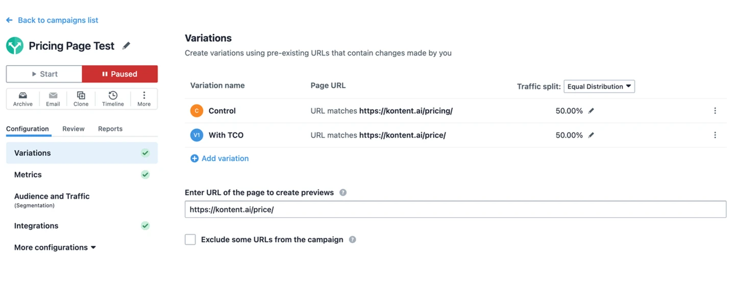
Using the VWO tool

The success of an A/B test hinges on the traffic your page receives. Testing on a page with just 100 visits won’t provide reliable insights. For meaningful results, aim to gather data from at least 1,000 visits—ideally, 1,000 visits per variant.

A/B test in practice

Our website has recently undergone many significant changes, so we implemented several A/B tests to ensure we got the most out of it.

One of our recent tests was optimizing the number of forms submitted on our Pricing page.

The original (control) version used an interactive slider to give a rough estimate of the volume discount.
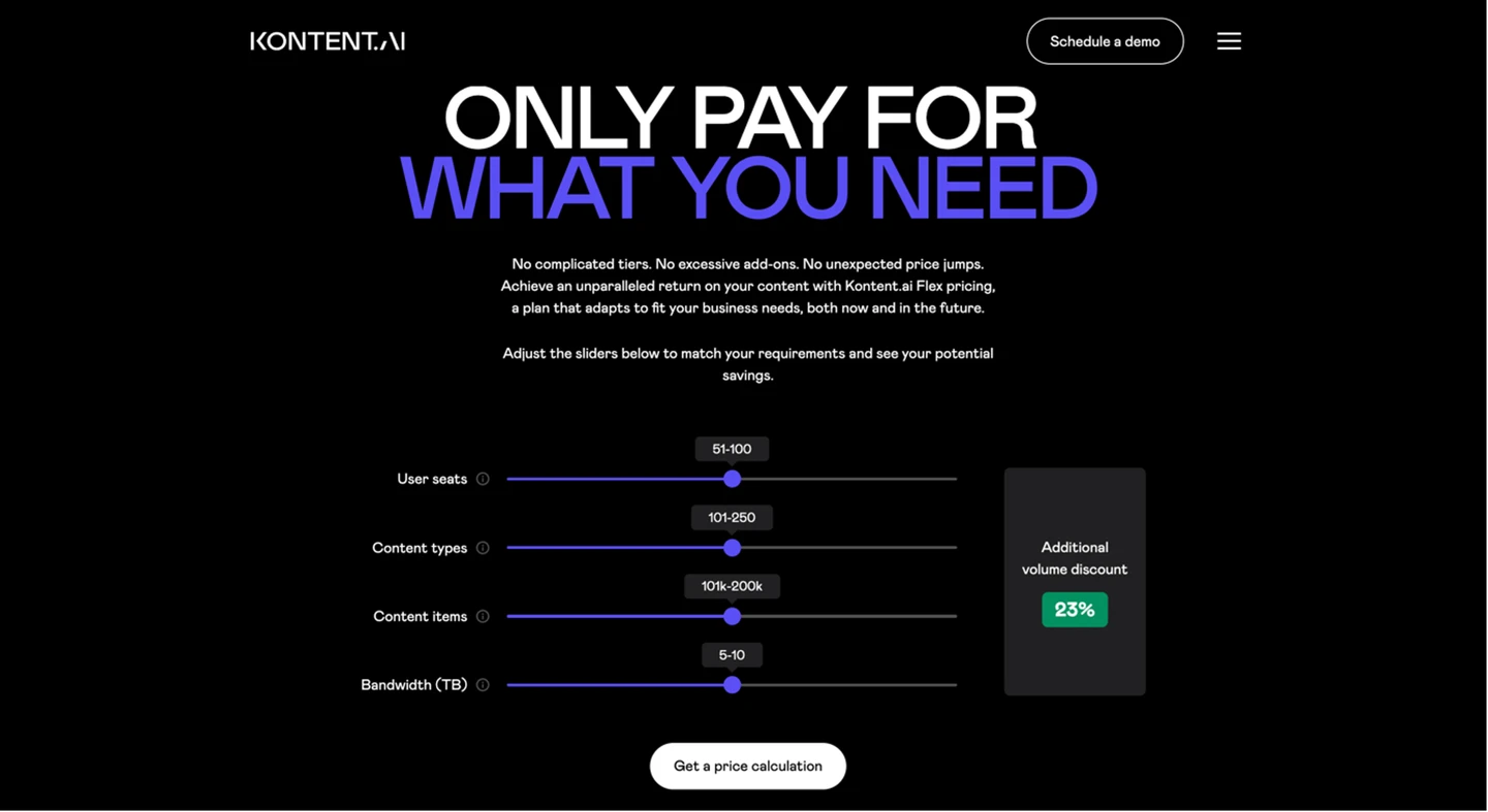
The original version of our page with an interactive slider

The tested version consisted of a set of two calls to action that gave visitors a choice. 

The same page with a set of two CTAs

And the results? The A/B test showed an expected drop in the conversion rate of 32% if we were to use the tested version.  

Since our Pricing page attracted substantial traffic, each version was tested with over 1,000 visitors, making it easy to confidently identify the winner.

Comparison of the two tested versions of our page

Pro tip: If you run out of ideas for testing, you can use the VWO browser add-on, which will scan your page and suggest ideas based on your goals.
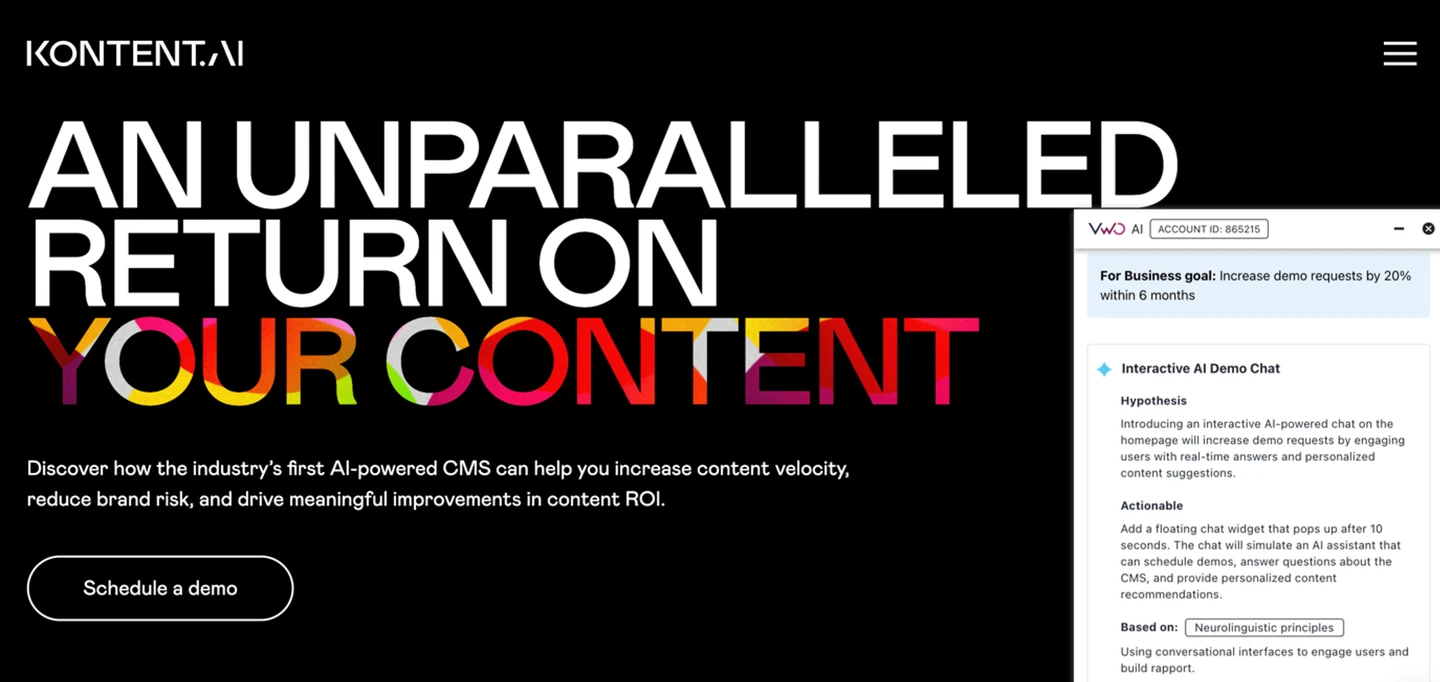
Suggestions made by the VWO browser add-on

Get your copy of the guide and discover how to:

  • Leverage AI to unlock your creativity
  • Optimize for SEO with a headless CMS
  • Manage all content in one place without the need for multiple tools

You may withdraw your consent at any time and manage your data in Consent Settings. You can read our privacy notice here.

Talk with an expert

Start your journey with Kontent.ai. We’ll show you how to achieve an unparalleled return on your content.