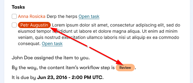
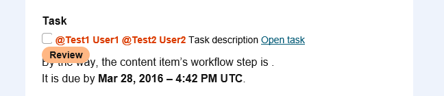
Today, we will leverage the knowledge from my previous article, Rounded buttons with shadow that work in Outlook, to build an inline rounded tag. We use these tags to simply highlight or exclude a specific piece of text from the rest of the content:
You would think that the experience with rounded buttons brings enough knowledge to achieve that. Little did we know at the beginning that what seems to work in a context of a block element isn’t the same in the context of inline content.
Here is the basic rounded tag code. Note that to support Outlook, it requires logic for estimating the width based on the length of the highlighted text (here it’s 78px).
The tag text isn’t vertically aligned with the surrounding text, which makes it look slightly off.
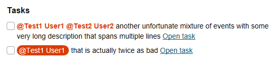
It also doesn’t handle longer text strings well—they may get cut off when wrapped onto hidden lines, or stretch the layout by becoming too wide.
Here’s an intentionally exaggerated example: the last word, “walls,” is pushed onto an invisible line, breaking the overall layout.
Making the content fit
As always, there is a simple HTML solution for standard clients by using white-space: nowrap and text-overflow: ellipsis. But Outlook doesn’t support any of that, so we need to add an extra mso-wrap-style:none style to the v:roundrect VML object for Outlook.
This has two consequences:
Text will no longer wrap when it doesn’t fit within the available space.
If there isn’t enough horizontal room, the object will automatically resize to fit its content.
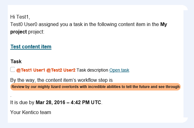
The second effect can make things even worse—the element expands further, continuing to break the layout:
You may also notice that the side spacing inside the highlighted text is reduced to an absolute minimum.
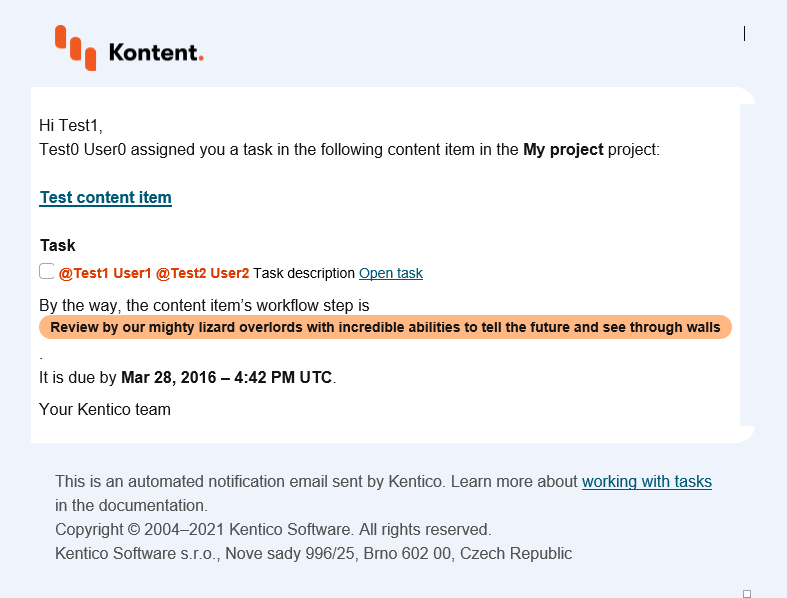
Since VML objects don’t support internal padding, we have to work around this limitation. Our solution is to insert explicit characters around the object text to achieve that. It’s not pixel-perfect, but it does the trick.
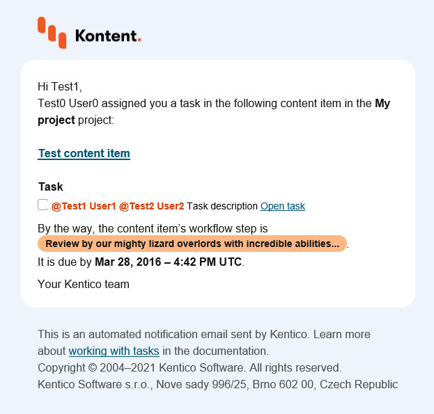
Next, we need to ensure the object doesn’t grow beyond the intended width. If it does, we’ll truncate the text and append an ellipsis (the classic three dots, also known as dot-dot-dot).
Because email clients don’t allow dynamic scripts, these checks are handled in the code that generates the email body. We set a maximum width and calculate a character limit using the same logic we applied earlier for width calculation—a simple but effective approach:
We leave a bit of breathing room, since the workflow tag can appear in various contexts—meaning we don’t target the full available width, but rather aim for about 85–90%.
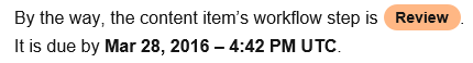
Vertical alignment of inline content
The last issue to solve is to align the text of the rounded tag vertically with the rest of the text on the same line.
The most obvious approach is to try using position: relative, just like we did for the button.
Unfortunately, this doesn’t work as it would in standard HTML. In VML, the reference frame for position: relative is the parent block element, not the element’s original inline position.
As a result, applying position: relative not only removes the space reserved for the workflow label but also shifts it completely out of context, breaking the intended alignment:
I also tried to nest the v:roundrect in another VML object or group, but, based on my experiments, such complex VML structures are not supported by Outlook at all. It can only handle one level of VML objects and their properties.
I couldn’t find any other suitable solution using VML, however, coming across this information about vertical-align in Campaign Monitor’s overview, I found out that it should be more or less supported by all email clients.
After a bit of testing with vertical-align, I discovered the following:
Keyword values for vertical-align either do not work or do not provide good reference points to get the proper vertical alignment that we need.
Values in px in a standard HTML element (SPAN in our case) seem to work well in Outlook and even adjust the position of a nested VML object, which is exactly what we need.
HTML-based email clients properly align the content just based on the existing HTML and CSS, and the px adjustment misaligns it, so we only want to apply it for Outlook.
So what I did was just conditionally wrapping the workflow label with a SPAN that uses hardcoded vertical-align:-6px. That’s it.
Here is the final code of the workflow label we are now using:
What if we told you there was a way to make your website a place that will always be relevant, no matter the season or the year? Two words—evergreen content. What does evergreen mean in marketing, and how do you make evergreen content? Let’s dive into it.
How can you create a cohesive experience for customers no matter what channel they’re on or what device they’re using? The answer is going omnichannel.
To structure a blog post, start with a strong headline, write a clear introduction, and break content into short paragraphs. Use descriptive subheadings, add visuals, and format for easy scanning. Don’t forget about linking and filling out the metadata. Want to go into more detail? Dive into this blog.
Lucie Simonova
Subscribe to the Kontent.ai newsletter
Get the hottest updates while they’re fresh! For more industry insights, follow our LinkedIn profile.