Implementing emails in 2025: Rounded buttons with shadow that work in Outlook
Rounded buttons and shadows are an easy task for CSS3. But can you use border-radius and box-shadow in formatted emails?

Written by Martin Hejtmanek

Rounded buttons and shadows are an easy task for CSS3. But can you use border-radius and box-shadow in formatted emails?
Written by Martin Hejtmanek
This article is a part of the Implementing emails in 2025 series. If you missed the introduction, read Implementing emails in 2025: Basics & how to test generated emails.
This part will be about the CTA (call-to-action) buttons in our redesigned emails and how we managed to implement them to match the design requirements.
Here’s what a typical CTA button implementation looks like:
Nothing complex: border-radius, centered text, and some shadow. Three lines of CSS. The problem is that Outlook doesn’t support any of that.
Making a button with rounded corners for Outlook is not unusual these days. There are even websites that generate the button code for you. Great to start with!
These solutions will typically only give you a plain button with no shadow. So let’s start there and add the shadow later.
Note: We used (and I’ll show you) VML buttons for Outlook inspired by the solutions above. However, there are also other options to consider.
As always, you need to have a component variant for Outlook and then for the other email clients.
For the button, start by creating a simple link (<a>) styled with standard CSS properties. This will render exactly as expected in email clients that use a modern HTML rendering engine.
Nothing fancy here—no rocket science.
<a href="https://www.enter-your-url.com" style="font-family: Helvetica, sans-serif;font-size: 14px;margin: 0;padding: 0 24px;color: #ffffff;margin-top: 0;font-weight: bold;line-height: 40px;letter-spacing: 0.1ch;text-transform: uppercase;background-color: #DB3C00;border-radius: 5000px;box-shadow: 0 8px 14px 2px #f45c2324, 0 6px 20px 5px #f45c231f, 0 8px 10px -5px #f45c2333;display: inline-block;text-align: center;text-decoration: none;white-space: nowrap;-webkit-text-size-adjust: none">Open subscription details</a>
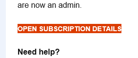
It displays fine in most of the email clients, but you get this incomplete view in Outlook:
To provide a proper background in Outlook, the link needs to be wrapped with a conditional v:roundrect VML object to give it an appropriate background area with rounded corners. The extra top-level DIV resets the default spacing and provides the reference frame that we will need in a few moments.
The resulting code is similar to what the above button generators would produce.
<div style="font-family: Helvetica, sans-serif;font-size: 100%;margin: 0;padding: 0;margin-top: 0"><!--[if mso]><v:roundrect href="https://www.enter-your-url.com" style="width:273px;height:40px;v-text-anchor:middle;" arcsize="50%" stroke="f" fillcolor="#DB3C00" xmlns:v="urn:schemas-microsoft-com:vml" xmlns:w="urn:schemas-microsoft-com:office:word"><w:anchorlock/><v:textbox inset="0,0,0,0"><center><![endif]--><a href="https://www.enter-your-url.com" style="font-family: Helvetica, sans-serif;font-size: 14px;margin: 0;padding: 0 24px;color: #ffffff;margin-top: 0;font-weight: bold;line-height: 40px;letter-spacing: 0.1ch;text-transform: uppercase;background-color: #DB3C00;border-radius: 5000px;box-shadow: 0 8px 14px 2px #f45c2324, 0 6px 20px 5px #f45c231f, 0 8px 10px -5px #f45c2333;display: inline-block;text-align: center;text-decoration: none;white-space: nowrap;-webkit-text-size-adjust: none">Open subscription details</a><!--[if mso]></center></v:textbox></v:roundrect><![endif]--></div>
Notice how the design can be handled differently for Outlook versus other email clients.
The usual approach is to start with standard HTML and CSS for modern clients, and then add Outlook-specific adjustments inside the <!--[if mso]> conditional block.
This pattern is consistent across nearly all email development solutions that need to support Outlook.
There is one catch, though. Outlook is not very good at auto-resizing objects based on the content. To get a good experience, especially with some larger padding, you simply need to tell it the size of the object. That is also the reason the button generators mentioned at the beginning require you to enter the button size along with the text.
In our solution, we simply calculate the width based on the length of the button text using some estimated average character width. The height is fixed. I am pretty sure it could have been done better, but this works for us pretty well.

Let’s quickly recap what we know so far:
The next logical step is to check the VML specification to see what tools it gives us.
As it turns out, VML includes a shadow element, so our first idea is naturally to apply it to the v:roundedrect object.
<!--[if mso]><v:roundrect ...><v:shadow on="true" color="rgb(128,128,128)" opacity="1.0" offset="2pt,2pt" origin="0,0" /><w:anchorlock/><v:textbox ...><center><![endif]-->
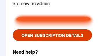
The problem with it is that the VML only supports a single-color shadow. No gradient shadows. And the result looks like this (colors aside). Not exactly what we need:

I even tried to configure a double shadow but with no luck. It didn’t work—a perfect example of how Outlook only partially supports the VML specification, rather than implementing it fully.
So, what options are left? As usual, it comes down to one of three paths: simple HTML and CSS, images, or VML.
What if there was a way to place a nicely shaped gradient beneath the button—something that could mimic a natural shadow? Let’s explore what options we have.
In standard HTML, we’d simply use absolute positioning. But, of course, most email clients don’t support that.
After digging through countless articles on email quirks, I eventually stumbled upon an official (though archived) Microsoft documentation on VML. That’s where I found the key insight:
position: relative behaves somewhat like position: absolute in regular CSS—but only for VML objects.My assumption is that, internally, this corresponds to MS Word’s shape behavior, such as “place in front of text” with custom positioning.
Using this approach, we can stack multiple shapes on top of each other. The next challenge is figuring out how to render something that looks like a button shadow, with the actual button placed on top.
Returning to the VML specification, I looked for elements that support gradients, and that’s when I found what I needed.
By creating another rounded rectangle and applying a fill using gradientradial fill type, then fine-tuning its values, I finally managed to produce a realistic shadow effect.
Here’s the code that made it work:
<v:roundrect style="width:281px;height:55px;position:relative;top:0;left:-4px;" arcsize="50%" stroke="f" fill="true" xmlns:v="urn:schemas-microsoft-com:vml" xmlns:w="urn:schemas-microsoft-com:office:word"><v:fill type="gradientradial" color="transparent" color2="#F45C23" focus="0" focusposition=".05,0.23" focussize=".9,0.25" /></v:roundrect>
The gradient shape is slightly larger than the button itself, with its focus area (the default area that has the full color intensity) carefully adjusted so it stays within the button’s boundaries while creating a consistent, natural-looking shadow possible.
Fine-tuning the shadow is the cherry on top, and it depends on the specific design.
The last step is to combine everything together. There is one last catch in the implementation, however. You need to place the shadow under the button, which means that you need to make the button position-relative, otherwise the button is under the shadow. But when you make everything relative, there is no object to allocate the space that the button needs. So we will add another v:rect object which will have a standard inline position and button height to allocate the vertical space for us.
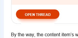
This is my final button code. A pretty small feature, but a lot of code for Outlook. But it works, and that is what matters!
<div style="font-family: Helvetica, sans-serif;font-size: 100%;margin: 0;padding: 0;margin-top: 0"><!--[if mso]><v:rect style="height:40px;width:0;" fill="f" stroke="f" xmlns:v="urn:schemas-microsoft-com:vml" xmlns:w="urn:schemas-microsoft-com:office:word" /><v:roundrect style="width:281px;height:55px;position:relative;top:0;left:-4px;" arcsize="50%" stroke="f" fill="true" xmlns:v="urn:schemas-microsoft-com:vml" xmlns:w="urn:schemas-microsoft-com:office:word"><v:fill type="gradientradial" color="transparent" color2="#F45C23" focus="0" focusposition=".05,0.23" focussize=".9,0.25" /></v:roundrect><v:roundrect href="https://www.enter-your-url.com" style="width:273px;height:40px;position:relative;top:0;left:0;v-text-anchor:middle;" arcsize="50%" stroke="f" fillcolor="#DB3C00" xmlns:v="urn:schemas-microsoft-com:vml" xmlns:w="urn:schemas-microsoft-com:office:word"><w:anchorlock/><v:textbox inset="0,0,0,0"><center><![endif]--><a href="https://www.enter-your-url.com" style="font-family: Helvetica, sans-serif;font-size: 14px;margin: 0;padding: 0 24px;color: #ffffff;margin-top: 0;font-weight: bold;line-height: 40px;letter-spacing: 0.1ch;text-transform: uppercase;background-color: #DB3C00;border-radius: 5000px;box-shadow: 0 8px 14px 2px #f45c2324, 0 6px 20px 5px #f45c231f, 0 8px 10px -5px #f45c2333;display: inline-block;text-align: center;text-decoration: none;white-space: nowrap;-webkit-text-size-adjust: none">Open subscription details</a><!--[if mso]></center></v:textbox></v:roundrect><![endif]--></div>
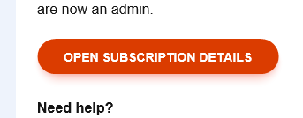
And here is what the final result looks like. We have managed to develop a button with the shadow for Outlook!
It wouldn’t be Outlook if there weren’t a catch. Outlook (and VML) don’t support transparency in gradients!
What you’re actually seeing isn’t a gradient fading into transparency—it’s a gradient transitioning from orange to white.
And since position: relative in VML doesn’t reserve any space in the layout (just like position: absolute in standard HTML), any element positioned this way can easily overflow nearby content if there isn’t enough negative space around it.
When you combine the lack of transparency with potential overflow, you can end up with a strange visual glitch—your “shadow” shape may suddenly reveal parts of its hidden white fill. Like this:
So be careful and design your spacing and shadow size with this limitation in mind.
I showed you how to create a nice button with a gradient shadow and explained the limitations the design brings. The solution works well but won’t scale for general-size containers. I’ll tell you more about these in a separate article.
This was the second part of the Implementing emails in 2025 article series, but there is still more to learn. Continue with one of these articles based on what interests you the most or read the whole series:
In the next article, I will show you how you can apply rounded corners to the inline content, which, in our case, means workflow tags and mentions.

What if we told you there was a way to make your website a place that will always be relevant, no matter the season or the year? Two words—evergreen content. What does evergreen mean in marketing, and how do you make evergreen content? Let’s dive into it.
Lucie Simonova

How can you create a cohesive experience for customers no matter what channel they’re on or what device they’re using? The answer is going omnichannel.
Zaneta Styblova

To structure a blog post, start with a strong headline, write a clear introduction, and break content into short paragraphs. Use descriptive subheadings, add visuals, and format for easy scanning. Don’t forget about linking and filling out the metadata. Want to go into more detail? Dive into this blog.
Lucie Simonova