Implementing emails in 2025: Outlook specifics for spacing and vertical alignment in tables
Outlook is a nightmare for email builders. But there are some general rules that will help you when implementing your email layout. Let’s see what they are.
In this part, I will discuss some rules and best practices you should keep in mind when implementing your layout for Outlook.
When it comes to general reusable layouts in HTML and CSS, DIV element with padding and margin is the king. But, in Outlook, there are some limitations.
A bit about spacing in Outlook
Outlook doesn’t handle CSS spacing (via padding or margin) on standard HTML elements very well. Instead, you’ll need to rely on a few specific techniques:
Typography elements (<p>, <h*>, <ul>, <li>) have built-in default margins in Outlook. You can sometimes reset them to 0, but setting precise custom values is unreliable—Outlook often ignores them.
CSS spacing applies consistently only to table cells (<td>). However, unless you explicitly remove the extra table spacing (see the code sample below), you may still not get the exact spacing you expect.
In short, if you need a container with consistent spacing in Outlook, a table-based layout is your safest option.
Building a container table
We’ll begin with a simple 1×1 table, which will later let us apply consistent spacing across email clients.
In this article, we’ll focus on basic containers—sharp corners and a white background only. Implementing rounded corners is a more complex topic, which we’ll cover separately.
For now, it’s essential to understand these fundamentals, as they form the foundation for everything we’ll build on later.
The crucial part is to reset all possible spacings at all levels:
Everything has margin and padding set to 0.
TABLE resets all the attributes influencing spacing (cellspacing, cellpadding, border, width) in HTML attributes as well as in CSS.
This produces the following base layout for our email body:
Applying padding
Next, let’s define the internal padding for our container. All you need to do is add the padding property to the table cell’s style—this approach works consistently across both Outlook and other email clients.
In our example, we’re using 24px of padding on all sides to match the design specifications.
Here’s the final version of the code, which differs from the previous example only by the added padding:
No extra tricks are needed. Our table layout already provides a consistent baseline across all email clients.
Here’s what the result looks like so far:
It doesn’t include rounded corners yet, but it’s a solid starting point.
Other options for consistent spacing in a table
An alternative to using padding inside a table cell is to add extra table cells with defined dimensions. For example, you can include an optional top or bottom row for vertical spacing, or a left or right column for horizontal spacing.
Here’s a simple table sketch to illustrate the approach we’ll take next:
Scroll horizontally to see more →
height: 24px; for top
width: 24px; for left
[CONTENT]
width: 24px; for right
height: 24px; for bottom
If a particular side doesn’t need spacing, you can simply omit the corresponding row or column—the rest of the layout will still work correctly.
The following code produces the same visual result as our earlier example that used padding:
You can see that it’s significantly more complex than the basic approach, but keep this 3×3 layout in mind. It’s an interesting concept we’ll revisit and partially build upon in the next article.
Avoid margin if possible
Since margins are unreliable in Outlook, it’s best to use padding exclusively across all email clients. This keeps your layouts consistent and allows you to maintain a single, unified development strategy.
You can also use the above TABLE container (without a background) to simulate negative space between elements by adjusting its padding. In our setup, we apply top padding throughout the content flow—except for the first element within each container, which naturally doesn’t need additional spacing above it.
You can still use margins in a few special cases, but be prepared to test thoroughly after every change because Outlook tends to break easily when margins are involved. That’s why I prefer to avoid using them altogether.
Vertical alignment in a table cell
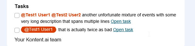
There’s one more important detail to mention when it comes to Outlook and tables. If a table cell contains only an image, its vertical alignment can behave inconsistently.
We ran into this issue in the task list example from the previous article. The layout consists of a table where the left column contains checkbox images (checked or unchecked) and the right column holds the corresponding task text.
Even though all table cells are set to vertical-align: top, we noticed that Outlook sometimes misaligns the images, depending on whether the adjacent cell contains one line of text or multiple lines.
In the example below, you can see how the second checkbox image is misaligned with its text—even though the HTML code and alignment settings are identical for both rows:
Here’s the initial code for the checkbox table cell. You can check that all alignment settings are identical and set to top:
All these alignments are correctly used by standard email clients, but Outlook somehow ignores them when the table cell contains only an image and uses its own logic.
Special character for help
I found a quick and simple fix to standardize the image’s position within a table cell. The idea is to add a small piece of text content inside the cell so that Outlook treats it like any other text-containing cell — while keeping that text invisible to the user.
The trick is to use the ‌ character (zero-width non-joiner). I’ve found it incredibly handy in many non-standard cases—even outside of email development. It doesn’t occupy any visible space, but it still counts as a text character, making it a perfect placeholder where even a regular space wouldn’t work. You can read more about it here.
By inserting ‌ before the image, the cell now behaves as if it contains text, meaning the image aligns with that invisible character rather than relying on Outlook’s unpredictable cell boundaries.
If you still need fine-tuning, you can combine this with inline vertical alignment (as described in the previous article).
Note I added the extra character just for Outlook with the standard outlook conditional markup.
Here is the resulting output on both table rows consistently aligned to text bottom:
What’s next?
This was the fourth part of the Implementing emails in 2025 article series, but there is still more to learn. Continue with one of these articles based on what interests you the most or read the whole series:
What if we told you there was a way to make your website a place that will always be relevant, no matter the season or the year? Two words—evergreen content. What does evergreen mean in marketing, and how do you make evergreen content? Let’s dive into it.
How can you create a cohesive experience for customers no matter what channel they’re on or what device they’re using? The answer is going omnichannel.
To structure a blog post, start with a strong headline, write a clear introduction, and break content into short paragraphs. Use descriptive subheadings, add visuals, and format for easy scanning. Don’t forget about linking and filling out the metadata. Want to go into more detail? Dive into this blog.
Lucie Simonova
Subscribe to the Kontent.ai newsletter
Get the hottest updates while they’re fresh! For more industry insights, follow our LinkedIn profile.