Size your images correctly to save bandwidth
 Jake Kula
 11 minutes
 Image transformation (API)
Image optimization can be achieved in many ways, but one of the easiest ways is to serve images in the correct dimensions. Learn how you can deliver an optimized user experience while maintaining high visual quality with techniques like sizing, defining aspect ratios, and adapting to different screen densities.
Consider how channels display your images
One way to optimize your images for different channels is to ensure your images are sized according to the display dimensions of each channel. For instance, a hero banner will be larger on a website than on a smartwatch app. It’s important not to serve a 1280 x 800 pixels image on a smartwatch app which might have a maximum display width of 396 pixels. You need to always consider how your channel-specific applications retrieve images served by Kontent.ai. Kontent.ai’s API suite includes image transformation, allowing you to specify the dimensions required by your channel application. This means you can consume a single high-quality image in different sizes without maintaining separate variations.Size your images correctly
When using image transformation API, you have the option to resize your images by using the width (w) and height (h) parameters. When these parameters have a value over 1, the image is resized to new pixel dimensions. This way, the resized image can fit your application or a mobile browser much better.
Let’s take a look at a few approaches for resizing your images.
 The request times in the examples below represent an image’s initial, un-cached load.
Example 1: Pixel-based resizing
As an example, let’s take the below image: Let’s load it in two different dimensions: the original and then a resized version for a website. Then let’s compare the network details regarding download size and time to load in the browser (un-cached). Original: 5,184 x 3,456 px Website: 1,600 x 1,067 px As you can see in the summary table below, there is a significant improvement in download speed and a reduction in image file size.| Original image (5184 x 3456) | Resized image (1600 x 1067) | What’s the difference? | |
| Size | 1.6 MB | 295 kB | 5.4x less |
| Request time | 466 ms | 26 ms | 17.9x faster |
Example 2: Percentage-based resizing
If you have a number of images that you need to scale down by the same amount, for example, to 20% of the original dimensions, it’s best to use the percentage-based sizing of the width and height. This means setting the width (w) and height (h) parameters to values between 0 and 1. For example, using the parameter h=0.2 results in an image height decreased to 20%.
View the image with its height set to 20% .
.
Example 3: Defining the aspect ratio
When resizing an image, you can specify how it is resized using thefit parameter and its values (clip, crop, or scale).
By default, when you resize an image without specifying fit, the API uses fit=clip by default and maintains the image’s original aspect ratio. However, you can change the fit to allow defining the image’s dimensions and aspect ratio.
For example, using fit=crop combined with smaller height and width parameters results in a cropped image. The crop is applied from the center of the image.
Example 4: Adapting to different screen densities
When considering display devices with a high pixel density, there’s another parameter that’s useful in combination with setting the image’s width and height – the device pixel ratio (dpr).
The dpr parameter eliminates the need to maintain multiple copies of the image to support different screen densities, such as for Retina displays (dpr of 2 or 3) or Android devices (dpr anywhere from 1.5 to 3.75).
The rule of thumb is to develop graphics that are larger than what would be represented on a standard screen and then scale accordingly.
Resized image (720 x 454, dpr=1)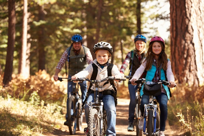 | Resized image (720 x 454, dpr=2)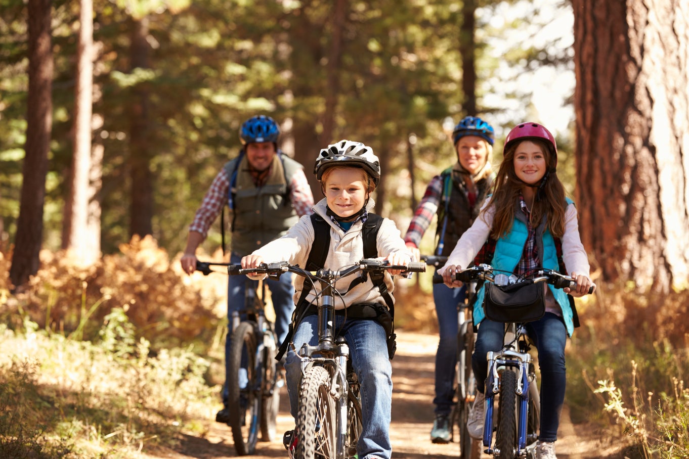 | Resized image (720 x 454, dpr=3)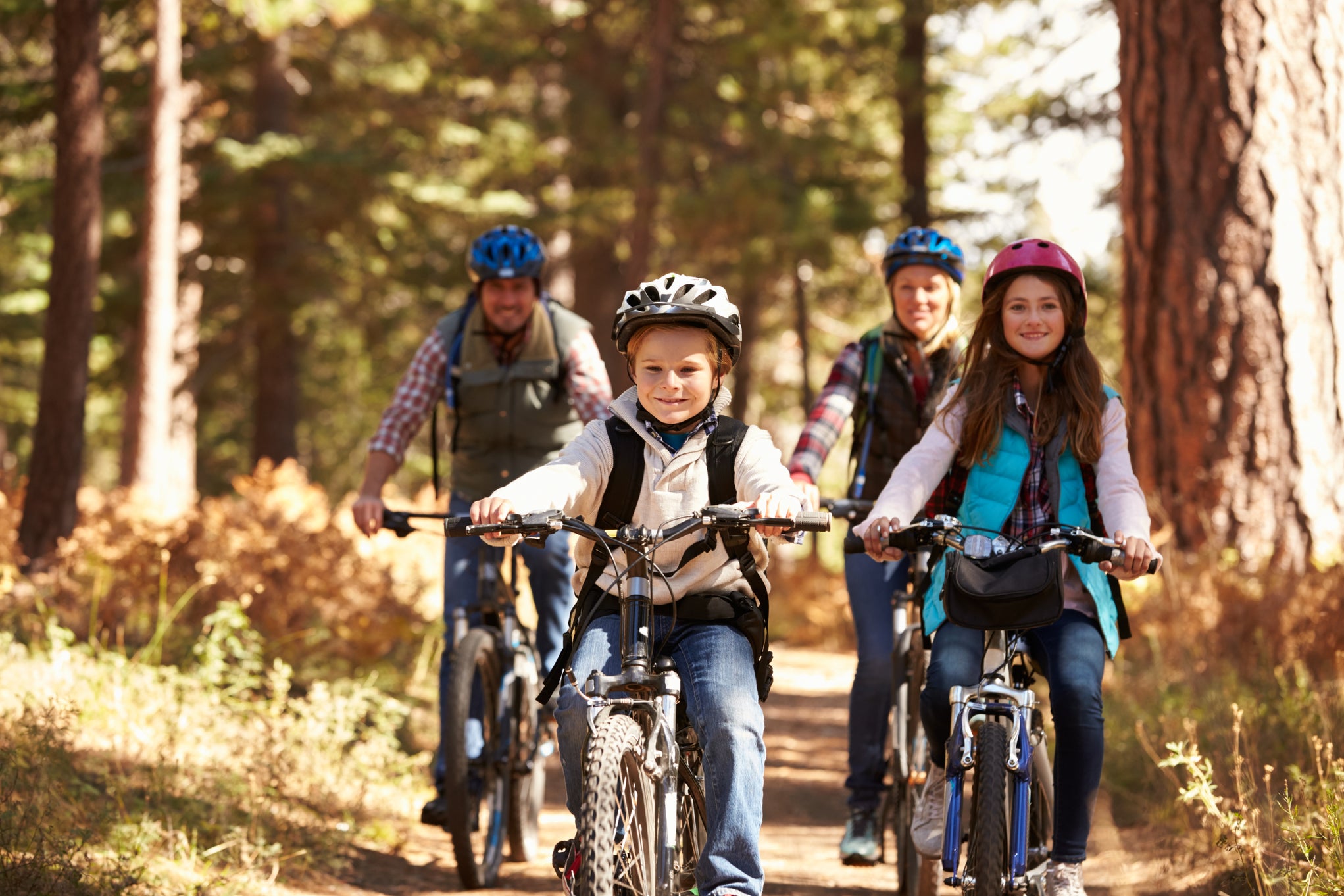 | |
| Size | 87 kB | 236 kB | 416 kB |
| Request time | 10 ms | 21 ms | 35 ms |
dpr=1 saves 329 kB over dpr=3, resulting in a 3x faster load speed for that device. At the same time, setting dpr=3 for high-DPR devices ensures that those screens’ image is as sharp as possible.
 Let browsers decide the device pixel ratioTo choose the correct device pixel ratio, use the right HTML markup
 , that is
 <img> with the srcset attribute so that browsers make the choice for you.Image sizing video example
In this video example, you will see how to apply image customization by resizing images as you request them from the CMS. The video explores both pixel-based and percentage-based resizing and also looks at specifying a device pixel ratio for high pixel density devices.
If you'd like to find out what else is possible, check out the image transformation API reference.
Sign in with your Kontent.ai credentials or sign up for free to unlock the full lesson, track your progress, and access exclusive expert insights and tips!