Writing for skimmers: A guide to formatting that boosts readability
Are your readers actually reading or just scanning and bouncing? Thoughtful formatting helps your content grab attention fast and deliver real value before it’s too late.
Let’s face it, most people don’t read online content. They skim.
We’re drowning in content, and readers know it. Attention spans are short, time is precious, and the competition for eyeballs is fierce. Research from Nielsen Norman Group (2024) confirms that fundamental scanning behaviors remain constant across 13 years of eye-tracking studies, with users making decisions about staying or leaving within mere seconds of arrival. If your blog post, landing page, or report isn’t formatted for quick consumption, chances are your readers will bounce before they get to the good stuff.
But you don’t need to change what you say—just how you present it.
You’re not sacrificing depth or quality when you format for skimmers. You’re understanding how modern readers consume content and designing your message to meet them where they are. When you focus on those who skim, you create a better experience for every type of reader, from the deep-dive researcher to the time-pressed executive scanning for key insights.
Here’s your comprehensive guide to formatting content that speaks to the skimmers while still delivering maximum value.
1. Use clear, descriptive headings
Headings are your content’s signposts. They guide the reader’s eye and help them decide whether to keep reading.
Think of headings as your content’s table of contents in action. A reader should be able to scan your headings and immediately understand the structure and value of your entire piece. This is especially crucial in B2B content, where decision-makers often need to quickly assess whether a piece contains the insights they’re seeking.
Advanced heading strategies:
Make every heading meaningful on its own. Avoid vague titles like “Next Steps” or “Getting Started”.
Use H2s and H3s to break down complex sections into scannable chunks.
Ask questions or highlight value (“Why This Matters”, “What to Do First”, “How This Saves You Time”).
Include keywords that your target audience is actively searching for.
Test heading clarity by reading only the headings—does the content flow make sense?
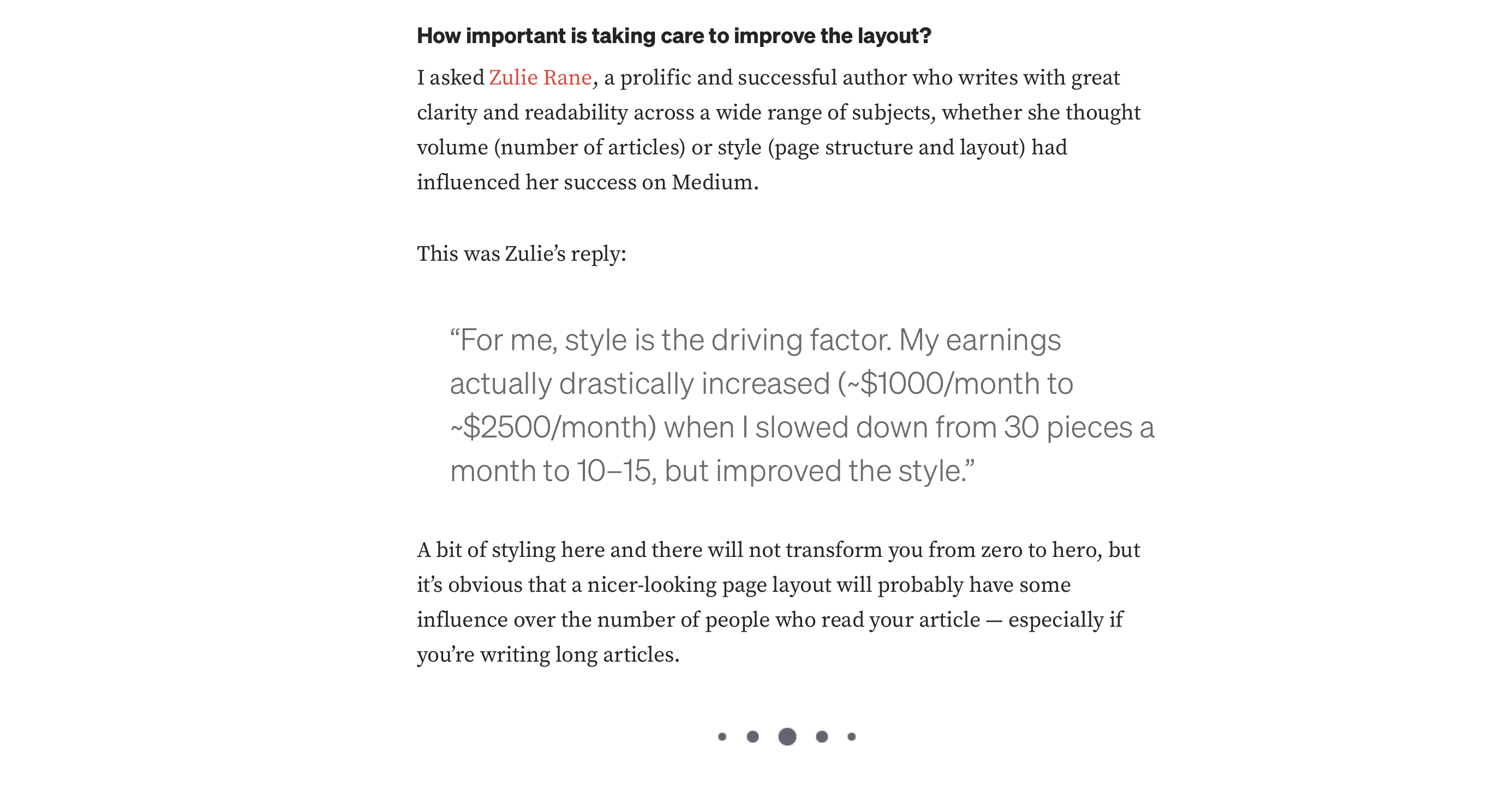
Pro tip: Use the “elevator test”: If someone read only your headings while riding an elevator, would they understand your main argument and key points by the time they reach their floor?
An excerpt from an article on using headings, source: medium.com/technical-excellence/creating-better-content-page-structure-and-styling-main-headings-and-subheadings-and-using-314cfa7b185f
2. Keep paragraphs short and sweet
Long blocks of text are a skimmer’s nightmare. A wall of words signals effort, and effort leads to exits.
Research in web usability consistently shows that shorter paragraphs perform better across all metrics—time on page, scroll depth, and conversion rates. Another 2024 research on web reading behavior demonstrated that scannable layout and concise writing improved measured usability by 47-58%.
Strategic paragraph techniques:
Limit paragraphs to 2–4 lines on desktop, even shorter on mobile.
Focus on one idea per paragraph, and resist the urge to pack multiple concepts together.
Use a conversational tone to maintain flow and connection.
Vary paragraph length to create rhythm. Mix one-sentence paragraphs with longer explanations.
End paragraphs with forward momentum that pulls readers into the next section.
Great writing won’t save a bad structure
You’ve got 10 seconds to hook your reader. Want them to stay, scroll, and share? Learn how to structure blog posts that actually get read.
3. Bold key takeaways strategically
When done right, bold text creates a “scannable skeleton” of your content. A reader should be able to read only the bolded text and still walk away with your core message and most important insights.
When to bold:
Important stats, data points, or research findings
Action items, results, or outcomes
Key terms your audience is scanning for
Counterintuitive insights or surprising facts
Critical warnings or urgent information
When NOT to bold:
Every other sentence because it loses impact and creates visual chaos
Expert approach: After writing your content, go back and bold only the phrases that, if read in sequence, would tell the complete story of your piece.
4. Use bullet points for clarity and impact
Skimmers love lists. Why? They’re fast, structured, and to the point. But lists also serve a deeper psychological function—they promise finite, manageable information that doesn’t require sustained focus.
Lists are perfect for:
Summarizing benefits, features, or advantages
Outlining step-by-step processes
Comparing options or alternatives
Presenting research findings or statistics
Breaking down complex concepts into digestible pieces
Advanced list techniques:
Use parallel structure—start each bullet with the same type of word (verb, noun, etc.).
Keep bullets roughly the same length for visual consistency.
Include brief explanations when needed, but keep them concise.
Use different list styles (bullets, numbers, checkmarks) to signal different types of information.
Consider using sub-bullets for complex points that need elaboration.
Recent 2022 research continues to confirm that users often read website content in an F-shaped pattern: two horizontal stripes followed by a vertical stripe, making well-structured lists crucial for scanability.
Example of effective list formatting:
Easy to skim: Readers can quickly identify relevant information
Saves mental energy: Eliminates the work of parsing dense paragraphs
5. Add strategic visual breaks
White space isn’t wasted space—it’s a reader’s breather. Visual breaks serve as mental rest stops that prevent cognitive overload and help readers maintain focus throughout longer pieces.
Effective visual break techniques:
One-sentence paragraphs for maximum emphasis
Extra spacing between major sections
Pull quotes, sidebars, or callout boxes to highlight key insights
Horizontal dividers or section breaks
Strategic use of imagery, charts, or infographics
Indented text or blockquotes for supporting information
Even simple formatting choices, like using an icon, emoji, or visual separator, can reset the reader’s focus and signal a shift in topic or tone.
Consider the “scroll experience”: As readers move through your content, how does it feel? Are there natural pause points? Does the visual rhythm keep them engaged without overwhelming them?
As a writer, I use white space, short lines, and structure to give my readers room to breathe. A well-placed pull quote or divider can be the difference between skimming and sticking with it.
By the way, did you notice this quote is a visual break?
Lucie Simonova
Creative Writer, Kontent.ai
6. Front-load value in every section
The first few words of any section matter the most. Skimmers often read the beginning of a sentence and decide whether to continue based on those initial words.
This principle, sometimes called “front-loading,” comes from journalism and technical writing, where the most important information always comes first. In the age of skimming, it’s become essential for all digital content.
Value front-loading tactics:
Start sentences with strong, specific keywords
Lead with the benefit before diving into explanation or context
Avoid burying your point under lengthy setup or disclaimers
Use active voice to create immediate clarity
Begin paragraphs with topic sentences that summarize the key point
Before and after examples:
Instead of: “One thing that many content creators tend to overlook when they’re thinking about time management strategies is...”
Try: “Save 3 hours weekly by batching similar content tasks together.”
Instead of: “There are several considerations to keep in mind regarding SEO optimization...”
Try: “Boost your search rankings with these five proven SEO strategies.”
7. Use smart formatting (but don’t overdo it)
Formatting is a tool for clarity, not decoration. Every formatting choice should serve a specific purpose in guiding the reader’s attention and understanding.
Strategic formatting options:
Bold for key takeaways and critical information
Italics for emphasis, definitions, or examples
Code formatting for technical terms, specific tools, or actionable items
Blockquotes for important insights, testimonials, or external perspectives
Highlight boxes or callout sections for tips, warnings, or bonus information
Emojis (when appropriate) to create visual anchors and guide the eye 👉
The golden rule: Formatting should enhance comprehension, not distract from it. If you’re unsure whether a formatting choice helps or hurts, default to simplicity.
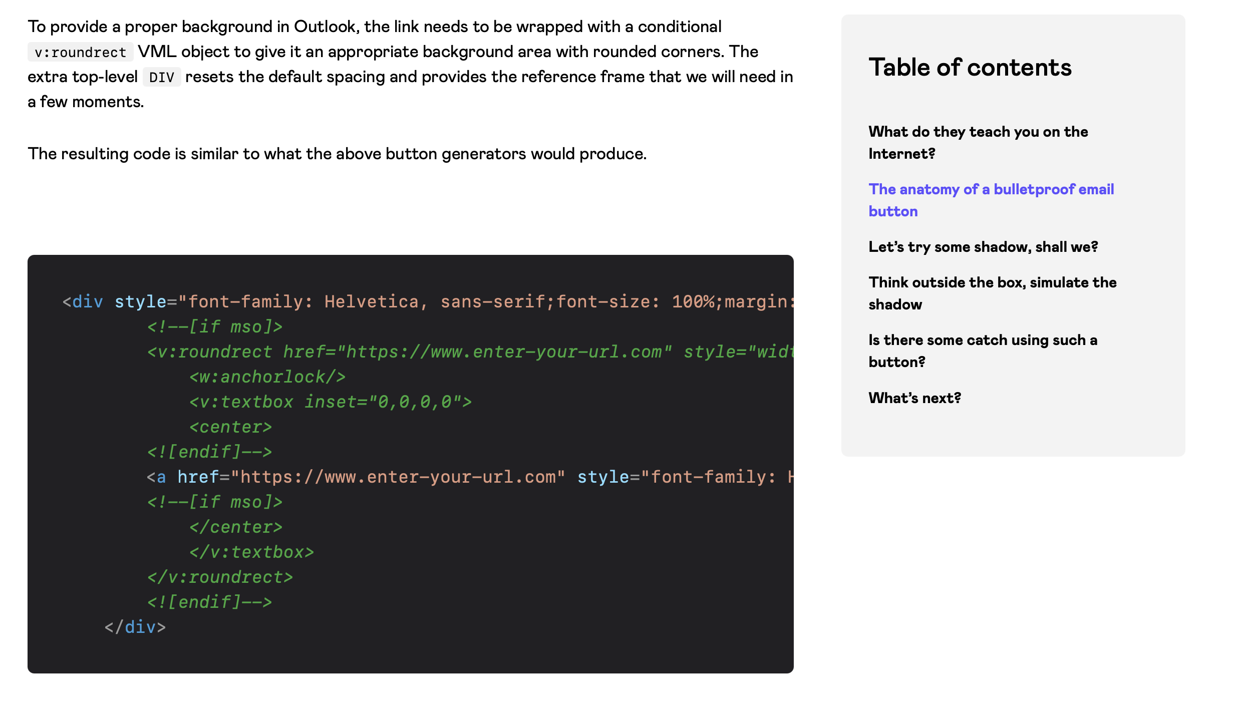
An article that uses code formatting to highlight technical terms and code snippets and includes sample code to show how an issue can be solved
Content accessibility guide: Importance, best practices, and practical tips
Great formatting helps fast readers—but true accessibility ensures all readers can engage. From color contrast to alt text, learn how to make your content inclusive and scannable.
8. Create scannable content architecture
Beyond individual formatting choices, consider the overall architecture of your content. How does information flow? Are there clear entry and exit points? Can readers easily navigate to the sections most relevant to them?
Architectural best practices:
Include a brief table of contents for longer pieces.
Use consistent formatting patterns throughout.
Create logical information hierarchies with proper heading levels.
Add internal links to related sections or resources.
Consider adding a “TL;DR” (Too long, didn’t read) summary at the top or bottom.
Use consistent spacing and visual patterns to create predictability.
A nice example of TL;DR summary at the end of a long chapter
Keep paragraphs even shorter, 2-3 lines maximum on mobile.
Use larger font sizes and plenty of white space.
Make clickable elements (links, buttons) easily tappable.
Consider how lists and formatting render on smaller screens.
Test loading times because mobile users abandon slow content faster.
Ensure headings create clear section breaks that work with thumb scrolling.
Make it easy to get the message
Writing for skimmers doesn’t mean dumbing things down. It means respecting your reader’s time and making it easier to access what matters most.
Good formatting is understanding that attention is your reader’s most valuable resource and treating it accordingly. When you format content thoughtfully, you create a better experience for everyone who engages with your content, not just those with short attention spans.
Today, the brands and creators who win are those who make consuming their content feel effortless rather than effortful.
So before you hit publish, ask yourself these critical questions:
Can someone get the core message just by skimming this?
Does this work as well on mobile as it does on desktop?
Would a busy executive find value in the first 30 seconds?
Does every formatting choice serve a purpose?
If the answer to all of these is yes, you’ve created experiences that respect your audience and deliver real value.
Ready to transform your content strategy?
Great formatting is just the beginning. The most successful content teams combine smart formatting with strategic planning, audience insights, and the right technology stack to scale their impact.
What if we told you there was a way to make your website a place that will always be relevant, no matter the season or the year? Two words—evergreen content. What does evergreen mean in marketing, and how do you make evergreen content? Let’s dive into it.
How can you create a cohesive experience for customers no matter what channel they’re on or what device they’re using? The answer is going omnichannel.
To structure a blog post, start with a strong headline, write a clear introduction, and break content into short paragraphs. Use descriptive subheadings, add visuals, and format for easy scanning. Don’t forget about linking and filling out the metadata. Want to go into more detail? Dive into this blog.
Lucie Simonova
Subscribe to the Kontent.ai newsletter
Get the hottest updates while they’re fresh! For more industry insights, follow our LinkedIn profile.