Even though most of us don’t ever want to see a 404 page, it’s smart to have one for your website. And if you need one, why not make the most of it? Here are some examples of brands who have made their 404 pages work hard for their business.
A 404 error appears when a page on your website can’t be found. A custom 404 page keeps users engaged, helps maintain trust, and prevents SEO issues by guiding visitors back to useful content. In this post, you’ll see creative, branded, and user-friendly examples that turn simple error pages into positive website moments.
Key takeaways
Keep it on-brand: A good 404 page should reflect your brand’s tone, design, and personality, and never look generic or out of place.
Get creative: Use humor, visuals, or interactive elements to turn a dead end into a memorable brand moment.
Guide visitors back: Always include clear navigation or links to help users find their way to useful content.
A 404 page doesn’t have to be just a simple error message and a link back to the homepage. Some companies have decided to be creative and turn their 404 pages into something more interesting, even a source of entertainment for their visitors.
As Renny Gleeson highlights in his404, the story of a page not foundTED Talk: “Little things, done right, matter. Well-designed moments build brands.”
We’ve collected some of our favorite error pages from Kontent.ai’s customers and other brands. If you’re looking for some 404 page inspiration—or just want to see what can be done—take a look at these error page examples!
What is a 404 error (and why customize it)?
A 404 error appears when someone tries to open a page that no longer exists or can’t be found on your website. It’s a standard response that tells visitors the content they were looking for isn’t available.
According to MDN Web Docs, common causes of 404 responses are mistyped URLs or pages that were moved or deleted without redirection to a new URL. As Wikipedia explains, a 404 error can sometimes be confused with a DNS error. A DNS error means the web address points to a server that doesn’t exist, while a 404 means the server is reachable, but it can’t find the specific page you’re looking for.
Customizing your 404 page helps you turn an error into an opportunity. Instead of losing users to frustration, a well-designed 404 page can guide them back to relevant content, suggest next steps, maintain brand trust, and even add personality or humor.
A clear, on-brand 404 page improves user experience and keeps your site looking professional. It shows attention to detail and signals to visitors that you care about every step of their journey.
Did you know?
According to arxiv.org, an analysis of the top 88,000 homepages found that 35.2% had at least one broken link, showing that even major sites have 404 errors.
404 vs soft-404: how Google treats each
From a search perspective, not all 404 pages are equal. Google distinguishes between a true 404 and a soft 404, and the difference can affect how your website performs in search results.
A true 404 correctly tells Google that a page no longer exists, allowing the search engine to remove it from its index. A soft 404 happens when a page looks like an error to visitors but still tells Google that everything is fine. In other words, the page says “not found” to people but “this page exists” to search engines.
That can cause confusion and lead Google to keep the page in search results, even though it doesn’t have real content. To avoid this, make sure your missing pages clearly tell both users and search engines that the page no longer exists.
You can do this by setting up your website so that these pages show a proper “not found” message and guide visitors back to other useful content. This helps keep your website tidy and your search results accurate.
Design best practices for 404 pages
A 404 page doesn’t need to be complex, but it should be intentional. Its purpose is to guide users back to relevant content while maintaining a consistent and trustworthy experience. When designing a 404 page, you should try to keep it on-brand, be clear and helpful, make sure you provide a way back on track, and consider adding a creative touch or brand personality.
Keep your 404 page on-brand
According to Bruce Clay, “your 404 error page should make it clear that the visitor is still on your website.” Keeping the error page consistent with other pages on your site means every word and image you use accurately represents the personality and tone of your brand.
The point is that you should never design a generic 404 page. If you do, it will reflect poorly on your brand, making it seem as though you don’t care about detail or customer experience—both of which are important factors in establishing trust with customers.
For example, if you’re selling luxury watches, then your 404 page should be sleek and elegant. Or maybe you’re running an e-commerce shop with animal products, so your 404 page shows an animation of a dog running around.
Keep your 404 page simple and helpful
If you feel like including a game or animation would be too much, you can always just keep it simple. A message like We’re sorry, page not found! is more than enough. You can also try showing some of your most popular content on the 404 page and include links to other areas of your site that might be helpful.
Whatever your niche is, you should also make sure to avoid technical jargon and explain what happened in simple terms. Keeping it clear and straightforward is sometimes the way to go.
Always provide a way to get back on track
If you have a documentation portal or hundreds of pages on your website, it’s good to include a search bar on your 404 error page so that visitors can quickly find the resource they need.
You can also add links to your homepage, main product pages, or most-visited articles to guide people in the right direction. The goal is to make recovery easy so people can quickly navigate to useful content and continue their journey without frustration.
Get creative with your 404 page
The creative message works particularly well on 404 pages because it gives you an opportunity to interact with visitors in a fun way that doesn’t feel like a chore.
You’re not simply telling people they’ve reached a dead end; you’re entertaining them while at the same time directing them back to where they want to go next.
Google Chrome has a hidden dinosaur game that you can play when your computer or phone is offline. Some 404 error pages also feature a little “game”, like running men with error messages such as Freaking out, and a panic button that changes each time you click on it.
When you’ve made sure all the above points are already included in your 404 page design, you can think about how to keep the visitors entertained.
Did you know?
A study on the Google Merch Shop revealed that a single 404 error reduced the desktop conversion rate by 57.5%, from 3.36% to 1.86%.
20 best 404 page examples (gallery)
Instead of Oops, we can’t find what you’re looking for, the TSSA’s (Transport Salaried Staffs’ Association’s) error message says This page has gone off the rails, which is a nice reference to the industry they work in:
On your 404 page, you can reference your industry with a witty pun.
Spotify also serves as a great example of how companies can maintain their branding and stay true to their identity, even on their 404 page:
Try to keep your brand identity even on a 404 page.
Mailchimp’s 404 page template is on-brand, keeping things nice and simple. The drawing of a donkey searching for the lost page adds a touch of fun for visitors who couldn’t find what they were looking for, guiding them to return to the homepage:
Keeping it nice and simple is often the way to go.
Pixar has nailed it with their 404 page. They turn the frustration of landing on the wrong page into a delightful experience. This approach is both entertaining and creative, capturing the essence of Pixar’s brand perfectly:
Even a 404 page can be entertaining.
This error page from Openmarkets is an example of how this can be done well: funny copy, entertaining visuals, and a clear call to action:
Use your 404 page design as an opportunity to play with fun visuals.
Marvel’s error page is superpowered. They showcase different heroes with fun little animations, and you can refresh the page to see another one. It’s a clever way to turn a mistake into a mini-adventure!
Turn a mistake into a mini-adventure just like Marvel did.
This 404 page by Netflix gently guides your attention to the TV show Lost in Space, playfully reminding us that even on Netflix, things can sometimes get misplaced:
Always be sure to guide your visitors’ next steps.
Lego’s error page uses humor and a recognizable character to gently let users know they’ve reached a dead end. The design is effective, paired with a touch of playful text:
Playful, on-brand copy is a great way to turn potential frustration into a funny moment on your site.
What’s essential on the Inzone Design’s 404 page is that it includes an easy way to go back to the website:
Make sure to include an easy way to go back to the website.
The Orange Coat website offers a helpful guide to get you back on track if you land on a broken page. By answering a series of yes or no questions, you’ll be directed to the information you originally sought:
A series of yes or no questions is a playful way to entertain the visitor.
The 404 message on Hubspot lets you know that the page you're looking for isn’t available—and they’re letting you know they’re sorry they missed you. Plus, they offer some helpful alternatives to keep you browsing happily:
Offer helpful alternatives to keep your visitors browsing.
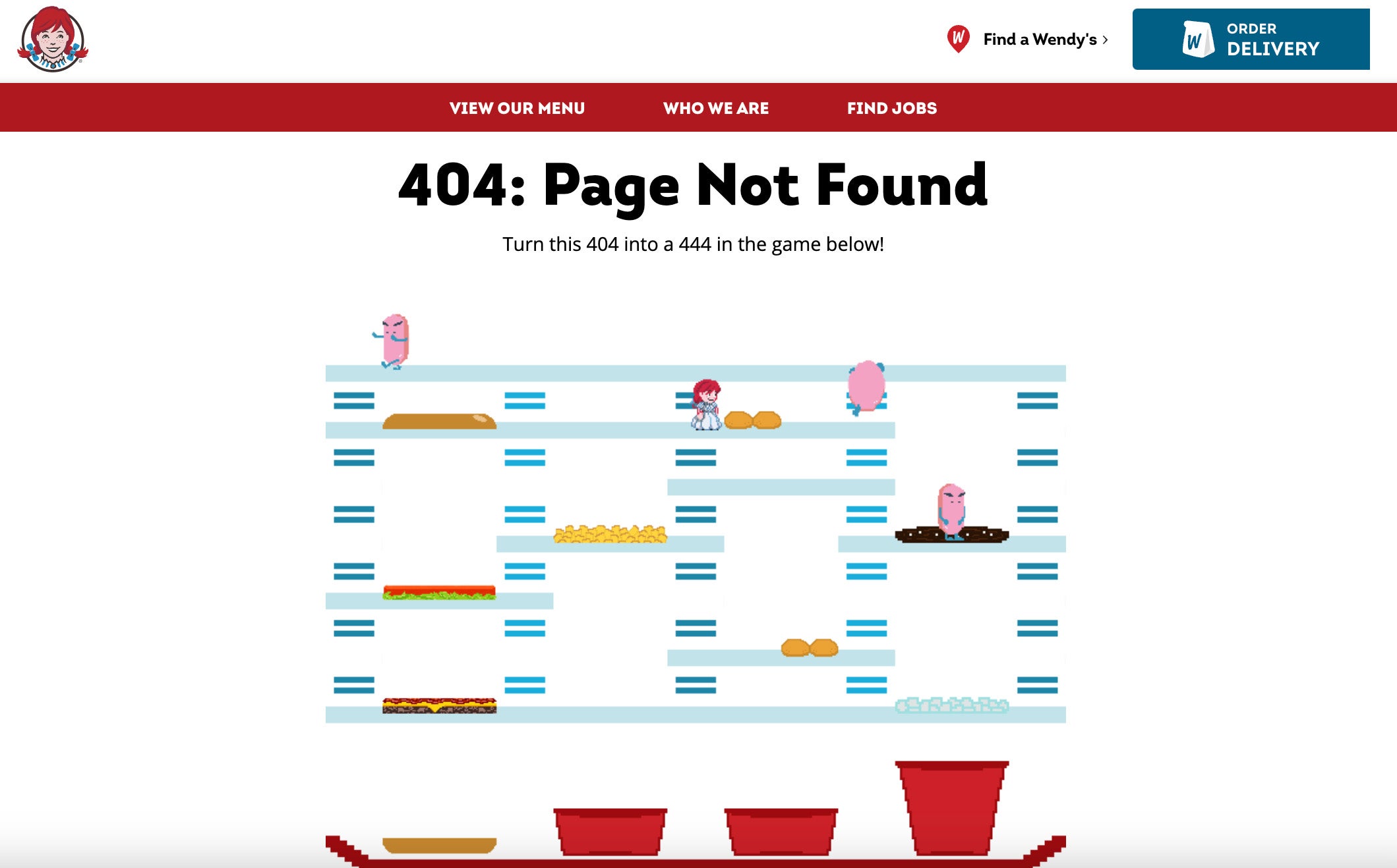
Wendy’s 404 error page offers a playable twist on the classic “BurgerTime” game. Users can build burgers while navigating the page, providing a brief distraction before returning to their browsing:
Adding a little game is a fun twist to your 404 page.
You can also try showing some of your most popular content on the 404 page and include links to other areas of your site that might be helpful, e.g., FAQs like England Hockey’s error page:
Try showing some of your most popular content on the 404 page.
Spica offers a straightforward error page featuring an illustration and friendly suggestions. Visitors can simply continue exploring the website by checking out their GemEx platform, browsing through their blog posts, or booking a demo:
Keeping it straightforward with your 404 page design is always a safe bet.
Horseware is all about keeping things simple and true to their brand. That's why their 404 page features a horse and a handy search bar, so customers can easily find their way to the page they need:
Keeping your 404 page on brand keeps consistency and maintains trust.
"Sorry, we can’t find what you are looking for", says Raymarine’s error page. This is another great example showing that you can’t go wrong with keeping your 404 page simple and adding a visual that truly represents your brand:
You can’t go wrong with keeping your 404 page simple.
Remember, a 404 page should not be just a dead end but a way back into your site where there’s more content and information waiting for them. Always tell users what happened and provide a way for them to get back on track, like this Youth Center’ page here:
Always tell users what happened and provide a way for them to get back on track.
The 404 page of Airbnb helps visitors find their way back by offering links to pages like home, search, traveling on Airbnb, or hosting on Airbnb:
Help visitors find their way back by offering links to pages like home.
Help Scout and their 404 page lets visitors of their website know that their charming pup, Scout, is there to guide them back to the page they need:
Animals are proven to work magic.
This error page by Carwow not only offers a way to head to their Car Chooser or homepage, but they also make sure you have a bit of fun by letting you play a simple game:
Many 404 page examples feature a simple game to entertain visitors.
How to design a custom 404 page (5 steps)
A good 404 page should be clear, helpful, and consistent with your brand. Start by explaining what happened in plain language, then guide users toward useful links or a search option. Keep the design familiar, add a touch of personality, and regularly check that everything works.
1. Start with a clear message
Let visitors know right away that the page they’re looking for can’t be found. Keep it simple and friendly, something like “This page isn’t available” or “We couldn’t find what you’re looking for.” Avoid technical language that might confuse users.
2. Keep your branding consistent
Use your logo, colors, and tone of voice so users instantly recognize your site. A 404 page that feels part of the same brand experience builds trust and reassures visitors they haven’t landed somewhere unsafe.
3. Add helpful navigation
Include clear paths to get users back on track, like links to your homepage, popular pages, or a search bar. The easier it is to move forward, the less likely users are to leave your site.
4. Consider adding personality or creativity
A small visual or clever message can turn frustration into a pleasant surprise. Think of illustrations, short animations, or brand-relevant humor that fits your audience and tone.
5. Test and monitor regularly
Check your 404 page from time to time to make sure links work, search functions perform correctly, and analytics are tracking visits. Regular updates ensure the page stays useful and supports both user experience and SEO.
Other resources you might find useful
If you enjoyed these Page not found examples, check out other articles from this series:
If you are looking for a way to quickly create content and keep visitors on your website, feel free to schedule a 1-on-1 demo or start your 30-day trial to see how a headless CMS can help you deliver engaging digital experiences.
What if we told you there was a way to make your website a place that will always be relevant, no matter the season or the year? Two words—evergreen content. What does evergreen mean in marketing, and how do you make evergreen content? Let’s dive into it.
How can you create a cohesive experience for customers no matter what channel they’re on or what device they’re using? The answer is going omnichannel.
To structure a blog post, start with a strong headline, write a clear introduction, and break content into short paragraphs. Use descriptive subheadings, add visuals, and format for easy scanning. Don’t forget about linking and filling out the metadata. Want to go into more detail? Dive into this blog.
Lucie Simonova
FAQ
A 404 error tells visitors and search engines that a page doesn’t exist. It usually happens when a link is outdated, a URL is typed incorrectly, or a page has been removed.
A 404 page is the page users see when they try to access a URL that doesn’t exist on your website. It signals that the page is missing, and it gives visitors a way to continue browsing by offering links, search options, or guidance back to useful content.
A 404 page is triggered when someone tries to visit a page that isn’t available. This can happen because of a broken link, a deleted page, a moved URL, or a typo in the address bar.
A well-designed 404 page doesn’t improve rankings by itself, but it can reduce bounce rates and keep visitors on your site longer. Clear navigation and links to other pages also help search engines understand your site structure.
Keep it simple, on-brand, and user-friendly. Offer clear instructions or links to popular pages, provide a search function, and make the page visually consistent with your website. Adding a small creative touch, like humor or an illustration, can make the page more engaging.
Start with a clear, friendly message explaining the page can’t be found. Keep your branding consistent, include helpful navigation like links or a search bar, and consider adding visuals or personality.
Ensure your 404 page adjusts to different screen sizes and devices. Use a responsive design so text, images, and navigation elements scale correctly. Keep buttons large enough to tap, avoid clutter, and test the page on smartphones and tablets to make sure users can easily read the message.
Subscribe to the Kontent.ai newsletter
Get the hottest updates while they’re fresh! For more industry insights, follow our LinkedIn profile.