Best product page design examples in 2024
The world’s leading brands, including our customers, are constantly coming up with incredible ways to design their product pages. Below are some of our favorite examples.

Written by Zaneta Styblova

The world’s leading brands, including our customers, are constantly coming up with incredible ways to design their product pages. Below are some of our favorite examples.
Written by Zaneta Styblova
For this article, we’ve collected inspiring product page examples to show you what it takes to create a high-converting page in 2024.
The companies featured below have one thing in common: they know how to make an impact with their pages. From color to imagery, they managed to create an engaging and persuasive design that makes you want to buy.
However, it’s easy to get it wrong. When your copy doesn’t engage, no one reads. And when your design confuses, people run for the hills. By displaying a little creativity and using some of the best practices in this post, you can get it right. Ready?
Ideally, your product page will inspire your visitors with creative page elements and persuade them with compelling copy. But what makes a product page great? What pushes it over the edge from mediocre to magnificent?
Let’s take a look at some of the best practices for creating truly irresistible product pages and then dive into what you can do to make sure they’re working as hard as possible for your business.
Best product pages:
Here are 11 tips on how to create high-converting product pages in 2024:
Now, let’s take a look at a few product pages we love:
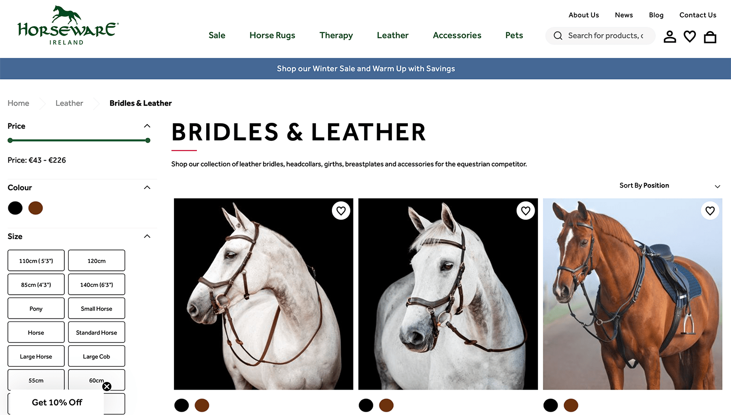
This page by Horseware.com featuring product listings is a testament to the marriage of functionality and aesthetic appeal. The user-friendly interface allows visitors to seamlessly navigate through the extensive collection, thanks to convenient filters that refine the browsing experience. The allure of the page lies in the use of professional photographs capturing horses adorned with the products.
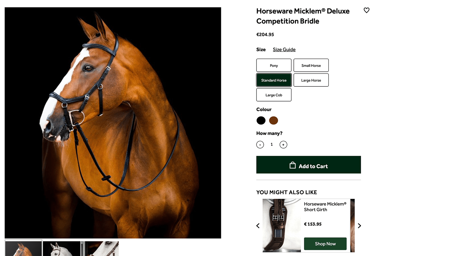
Displayed on the product detail page design is a striking and aesthetically pleasing image showcasing a horse with the leather bridle. This focal point is strategically designed to evoke a desire to purchase the product. Does it succeed in capturing your attention and interest? Without a doubt, we believe so.
Implemented by Marino Software (check out the customer success story)
Orangina is a popular citrus beverage originally created in France. Known for its distinctive, bulbous bottle and slightly pulpy texture, Orangina has become a beloved soft drink in many countries around the world.
Orangina’s interactive product page offers an engaging online experience that reflects the brand’s playful nature and vibrant brand identity. When users hover their mouse over product images, the images animate and move, providing a lively and immersive browsing experience.
This interactive feature draws attention to the products and also enhances user engagement, making the online shopping experience more memorable.
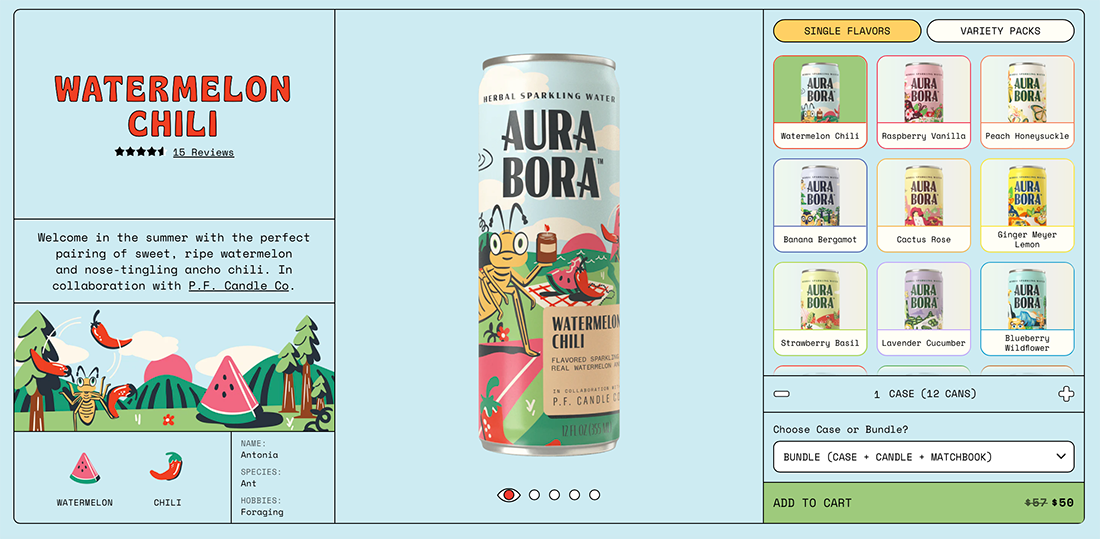
Aura Bora is a brand of sparkling water made from herbs, fruits, and flowers. With flavors like Watermelon Chile or Strawberry Basil, Aura Bora stands out for its inventive and natural ingredient combinations.
Their identity as a bold and innovative brand in the crowded beverage market shows from their product page, too. Their unconventional design sets them apart from typical e-commerce sites, with vibrant and artistic visuals featuring illustrations that evoke a sense of creativity and fun. This unique approach to their ecommerce product presentation captures attention and enhances the overall shopping experience.
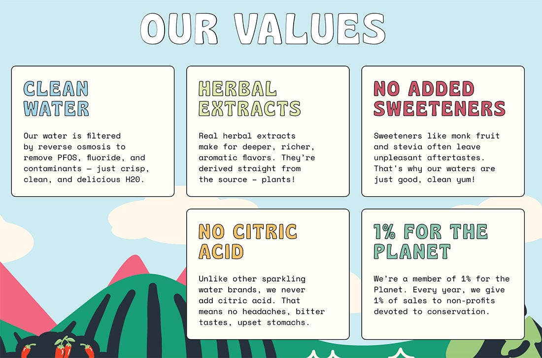
Including an “Our values” section on Aura Bora’s product page is a brilliant strategy that resonates with modern consumers who prioritize transparency and ethical practices in their purchasing decisions. The brand’s commitment to important principles, such as clean water and the absence of added sweeteners, aligns with the growing consumer demand for healthier and environmentally friendly products.
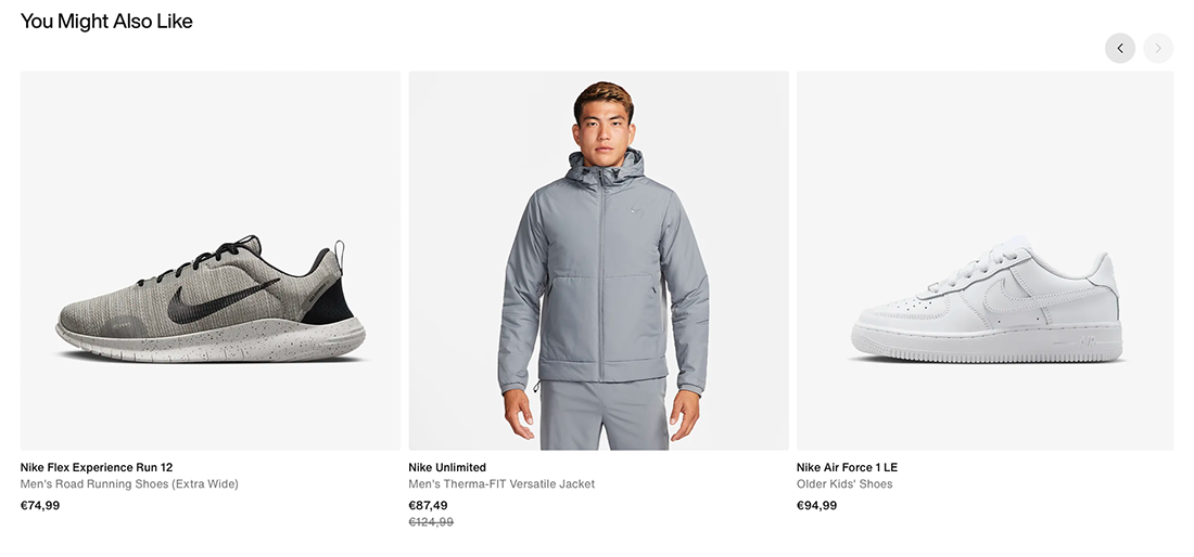
Fashion brands like Nike use a “You Might Also Like” section on their product pages to make shopping more enjoyable and keep you browsing. This feature gives you personalized suggestions for other clothes or products that go well with what you’re currently looking at.
Sometimes, customers don’t know about all the products a brand has. This section shows them new or related items they might not have searched for, helping them see more of what the brand has to offer.
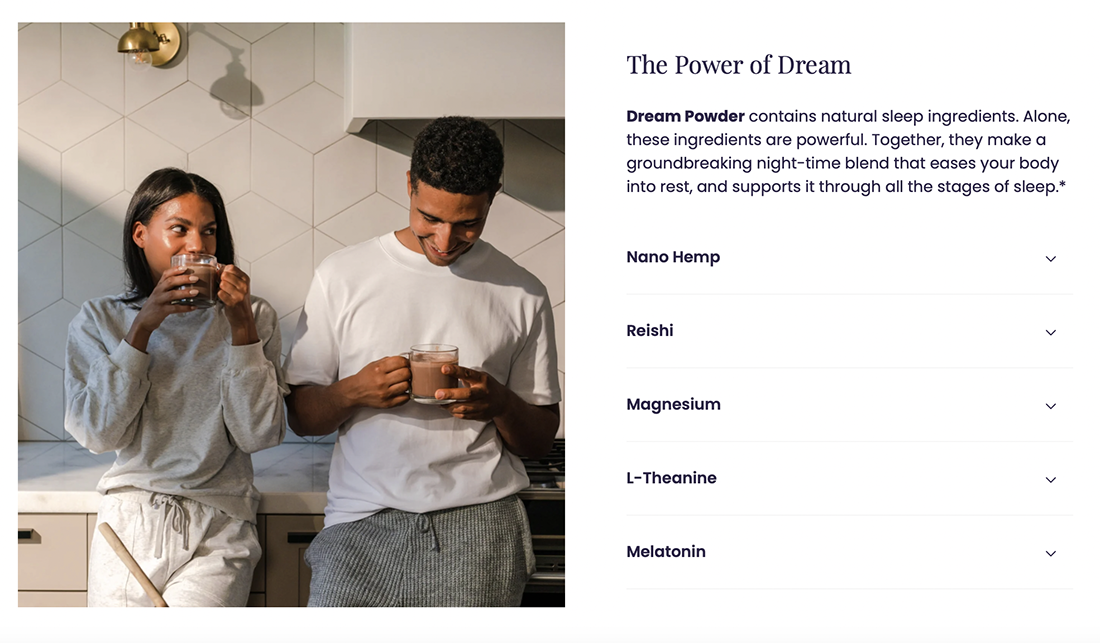
Beam is a wellness brand that creates high-quality, natural supplements to help with sleep, focus, and overall well-being.
Beam’s product page includes a handy FAQ section that addresses common questions and concerns, making it easy for customers to understand how to use the products and what to expect. By offering clear and detailed answers, the FAQ helps clear up any doubts or concerns customers might have, making their shopping experience easier and more reassuring.
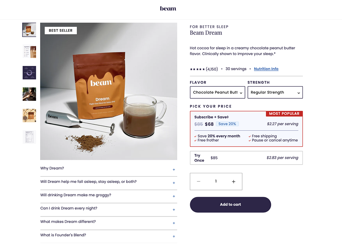
Their product page also features ingredient lists with their explanations and/or their benefits, which is extremely helpful, especially since some supplements might include ingredients that customers may not be entirely familiar with. Having this on a product page helps customers understand what’s in the product and helps them feel more confident about making a purchase.
Sharing your expertise and knowledge with users is paramount, especially when it comes to providing valuable resources like a free daily intake and upper-level nutrient chart in the context of Integria, a distributor of global leading nutritional and complementary healthcare brands.
By disseminating this information, you empower users to make informed decisions about their health and wellness. Sharing your know-how becomes a cornerstone for building a supportive community, as users are equipped with the tools they need to make conscious choices for a healthier lifestyle.
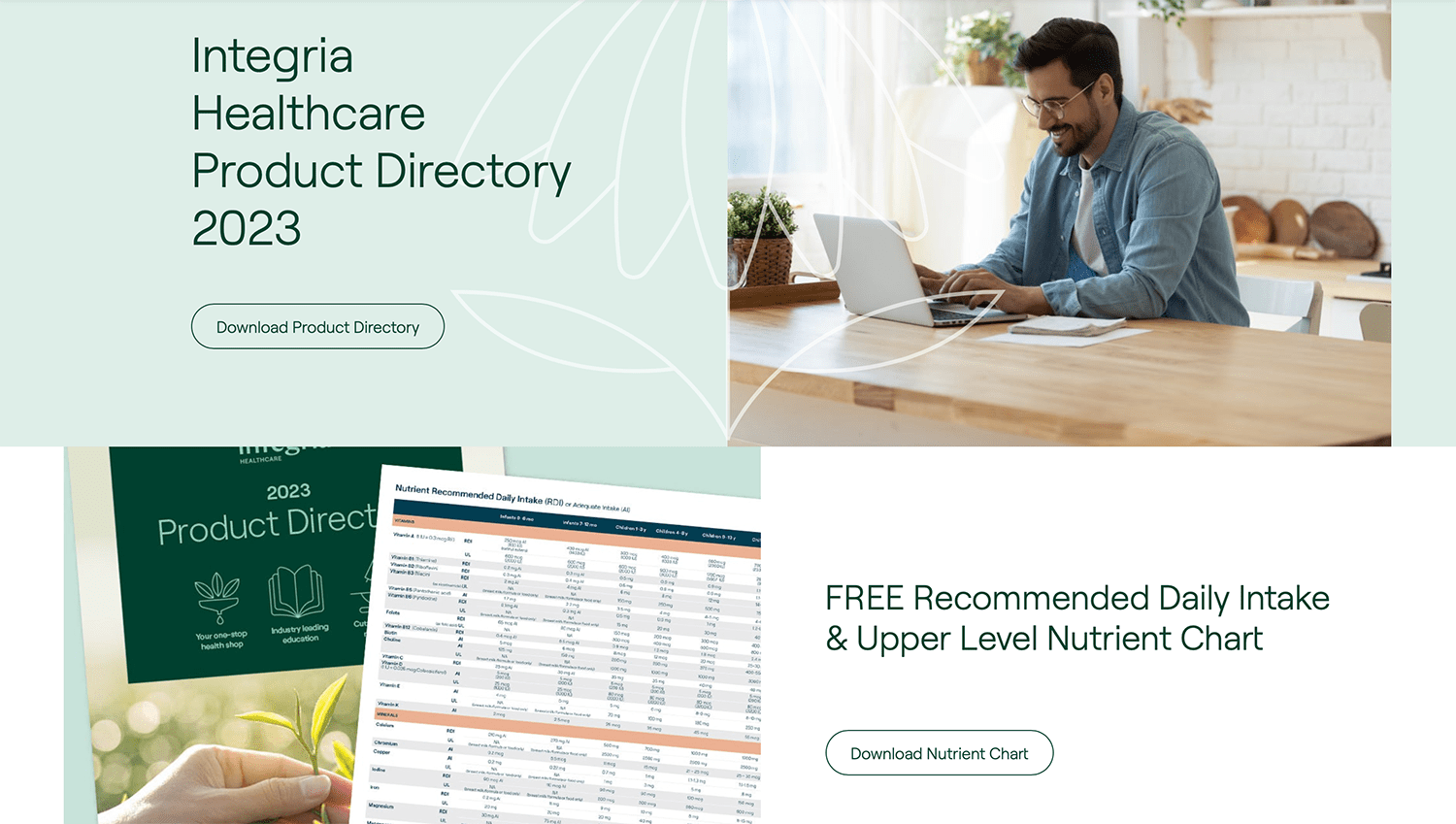
Implemented by Bound (check out the customer success story)
Starbucks’ product page is designed with a clean and minimalist approach, featuring simple filters that help customers easily find what they’re looking for without feeling overwhelmed. This design keeps the page clear and user-friendly, making the shopping experience smooth and enjoyable.
In addition, the page is interactive—when you hover your mouse over a product, it instantly shows whether the coffee is available as whole beans, ground, or pods for a machine. This adds a layer of convenience, helping customers quickly identify the right product to suit their preferences.
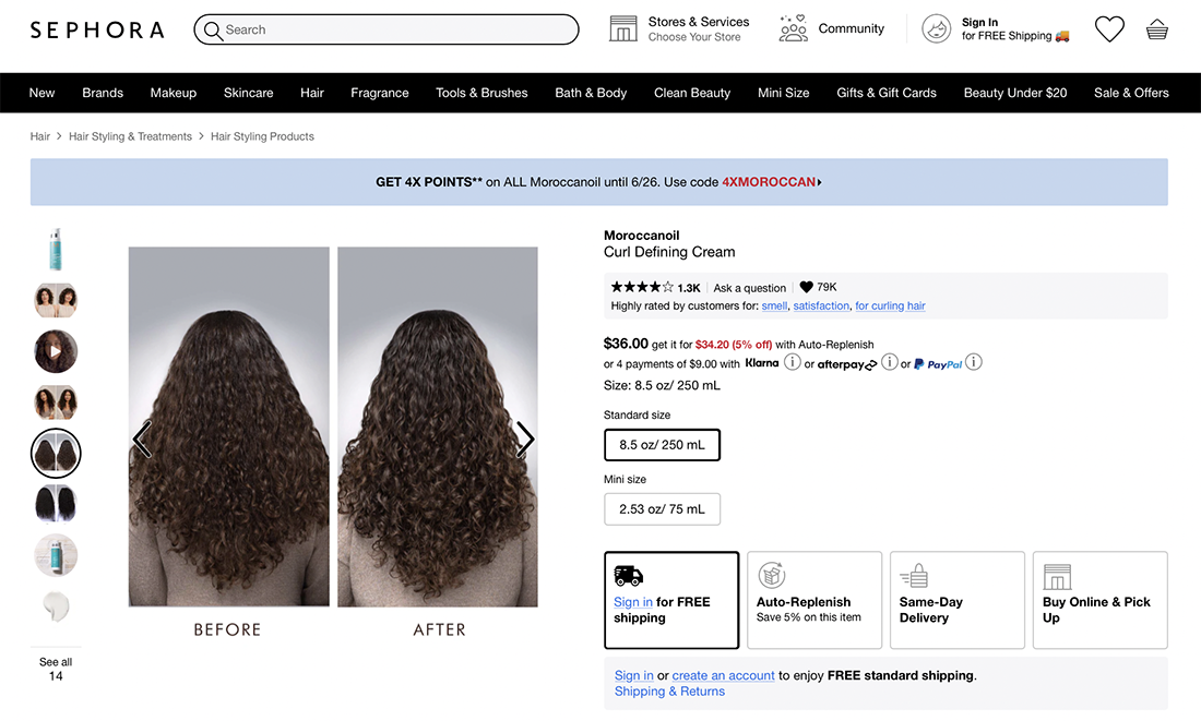
Sephora’s product pages include before and after photos that let the customers see the real impact of a product, so they can get a sense of how it might work for them. It’s like getting a sneak peek at the results before you even try it out yourself.
Before and after photos show transparency a build trust, helping visitors make more informed and confident decisions.
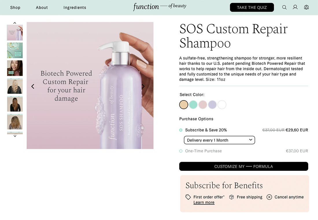
Function of Beauty is a personalized haircare and skincare brand that creates custom formulas tailored to individual needs and preferences. Their product pages use soft, pastel colors that perfectly align with their brand’s identity of gentle, personalized care. This soothing color palette creates a calm and inviting shopping experience.
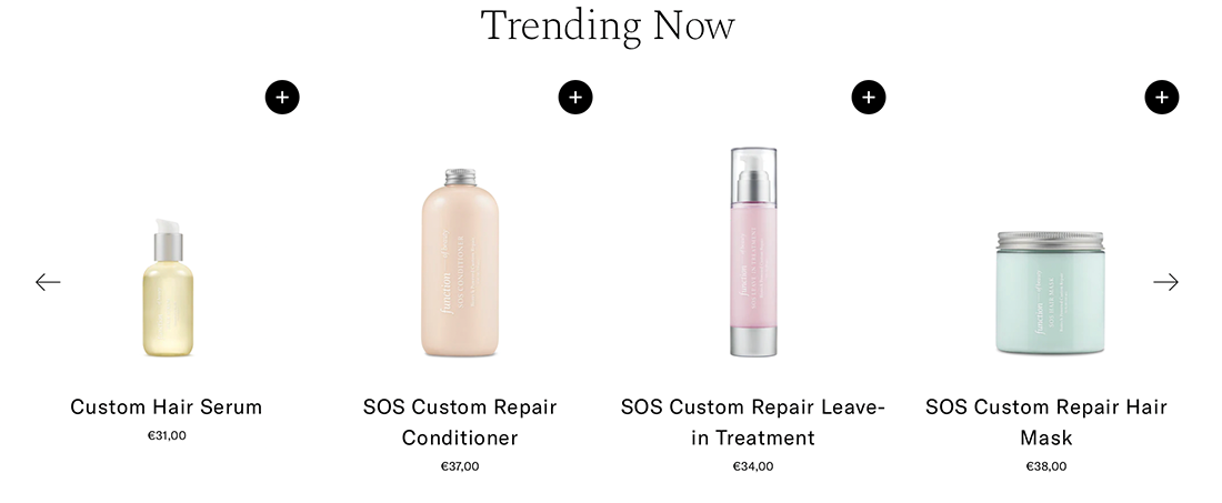
They also feature a “Trending Now” section, similar to “You Might Also Like,” but with a twist—it creates a sense of urgency by highlighting popular products that are currently in high demand. This section encourages customers to explore and consider these trending items, keeping them engaged with the most popular offerings.
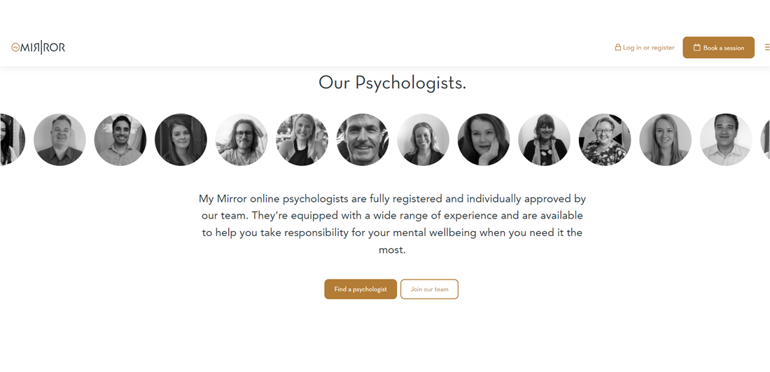
This product page by My Mirror uses statistics about mental health to show visitors how common psychological distress is. However, if you decide to use some specific data and facts, always remember to use only reliable sources and mention them (you can include a few footnotes at the end of the page).
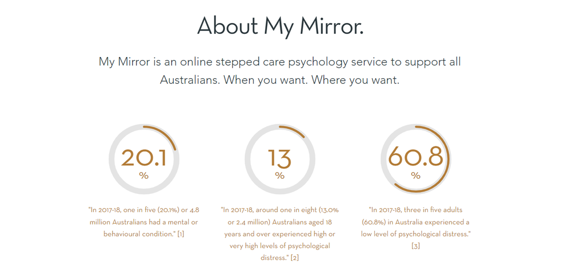
Stats and figures are powerful and persuasive, but they should always be accompanied by a personal story so that visitors can really understand what that means for real people in their lives. The page talks about the team as well as the psychologists that the client will be encountering:
Implemented by Devotion (check out the customer success story)
IKEA’s product pages include videos of their products, allowing visitors to see how these items might fit into their homes and daily lives. These videos are incredibly helpful because they offer a dynamic, real-world view of the products in action, showing different uses, features, and styling options.
Lululemon’s product pages feature a “What’s My Size” button that helps visitors find their perfect size by answering a few simple questions. This interactive tool takes into account individual measurements and preferences to recommend the best fit, reducing the chances of needing to return items.
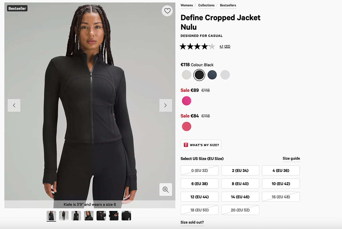
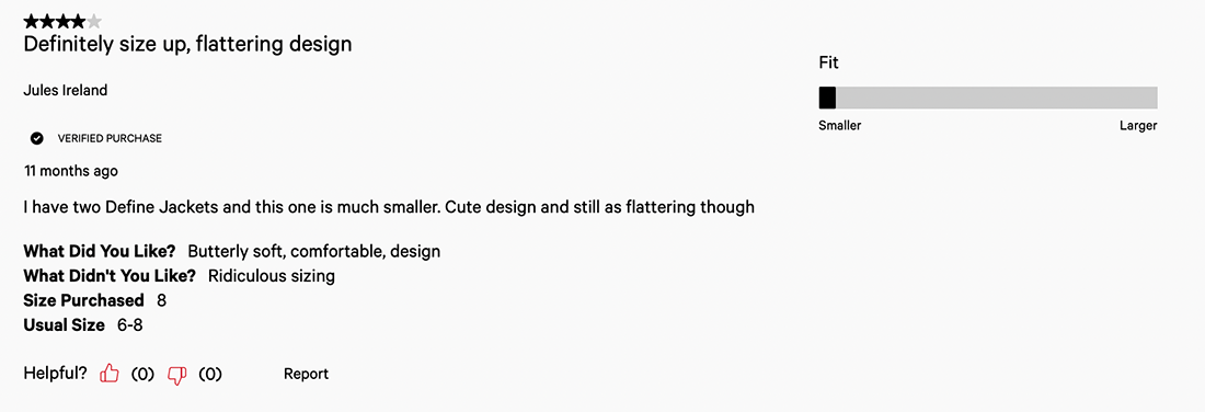
Lululemon also includes customer reviews on their product pages. Reading about others’ experiences with the fit, comfort, and performance of the products can give potential customers a better idea of what to expect.
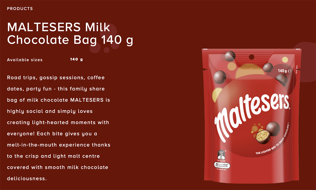
Maltesers use the art of storytelling on their product pages to vividly describe the perfect moments that a pack of Maltesers can accompany. They paint a picture of enjoying Maltesers during a road trip or a cozy coffee date, emphasizing the light-hearted ambiance Maltesers can help co-create. By targeting the imagination and senses, Maltesers create an emotional connection with their audience, making the product more appealing.
LEGO’s product pages often offer a “gift with purchase” promotion, adding extra value for customers. This incentive encourages more purchases and also makes the shopping experience more rewarding for customers.
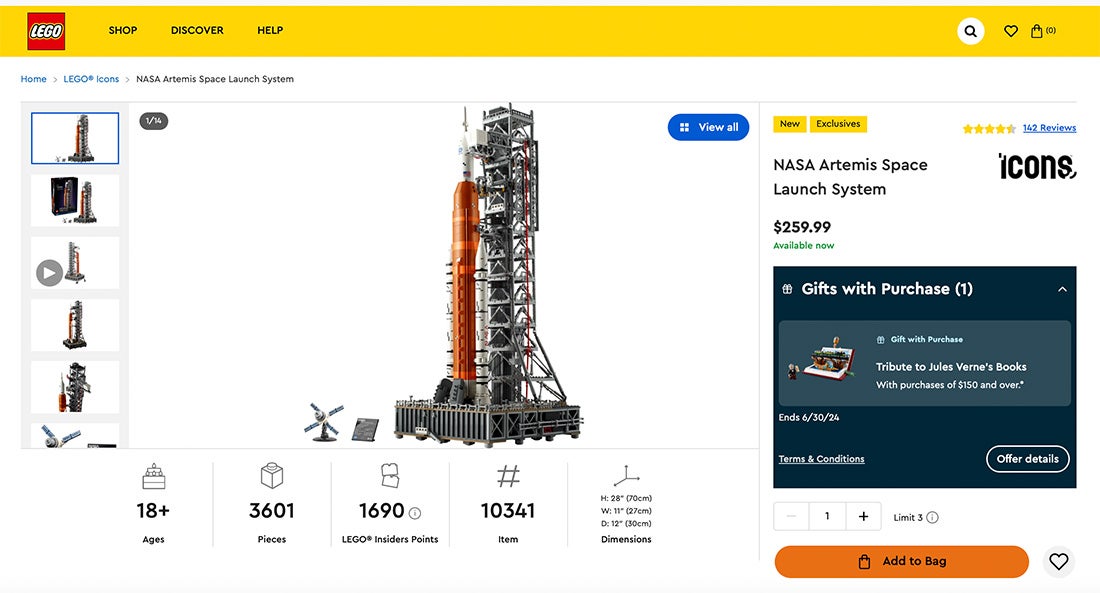
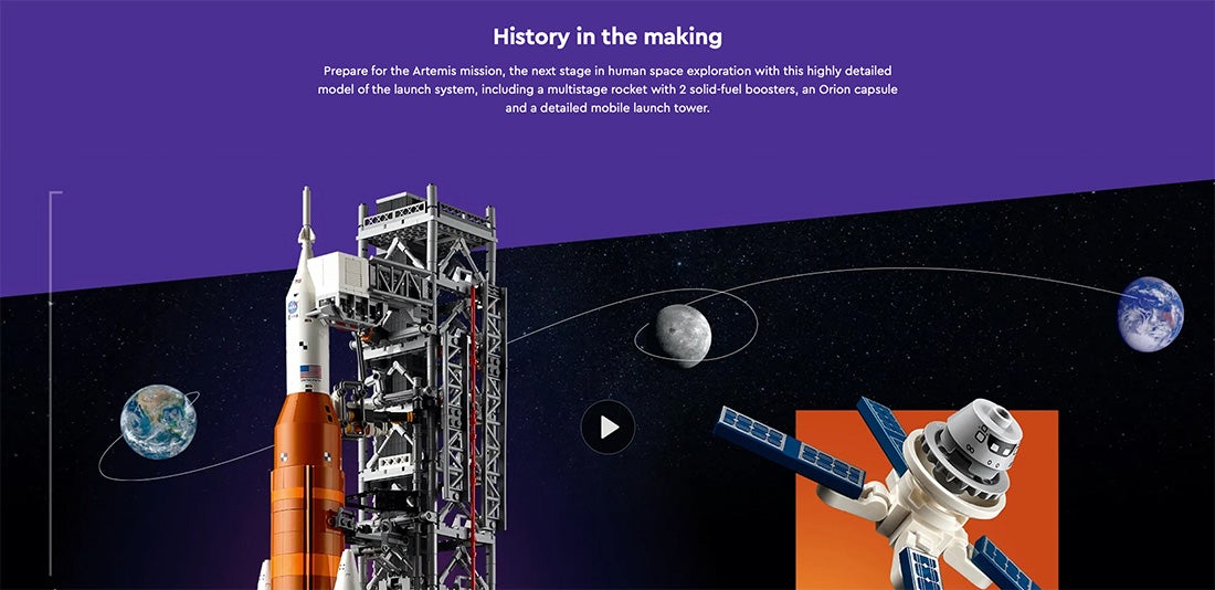
LEGO also includes videos on their product pages, showing the building process, creative possibilities, and the final outcomes. These videos make the page more dynamic and enjoyable, helping to capture visitors’ attention and keep them engaged for longer.
According to Wyzowl, 91% of businesses use video as a marketing tool, which highlights the increasing importance of video in marketing strategies. Research shows that videos can really enhance sales and conversions because they keep customers more engaged and help them understand products and services better.
This is a great example of an e-commerce product detail page by Kimball Hospitality that does everything right. It’s clean, uncluttered, and easy to navigate, with the most important information getting pride of place. The page displays the product’s features and benefits, specifications, and materials in a user-friendly format.
This ecommerce product page is designed to enhance the user experience, making it easy for customers to find exactly what they need and make informed purchasing decisions.
Implemented by BizStream (check out the customer success story)
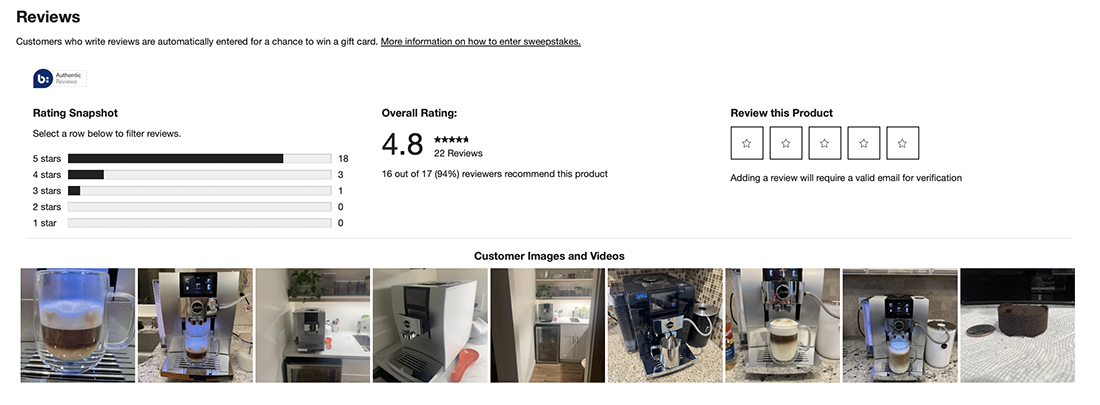
Crate & Barrel is a renowned home furnishing retailer known for its stylish and high-quality furniture, decor, and kitchenware. On their product pages, Crate & Barrel features “free and fast store pickup,” which allows customers to collect their purchases from a nearby store. This option is great for customers who prefer quick access to their items without waiting for shipping.
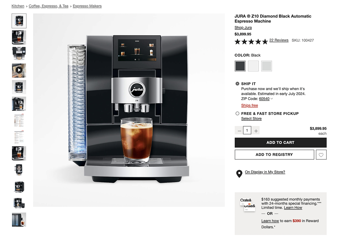
Crate & Barrel also lets customers upload pictures and videos of the products they’ve bought in the review section. Seeing photos and videos of products in real homes gives shoppers a better sense of how the items might look and function in their own spaces. This user-generated content also fosters a sense of community among customers.
Did you enjoy these product page design examples? Check out our blog post on the best landing page design examples.
If you are looking for ways to improve your website, feel free to schedule a 1-on-1 demo or start your 30-day trial to see how a headless CMS can help you deliver engaging digital experiences.

What if we told you there was a way to make your website a place that will always be relevant, no matter the season or the year? Two words—evergreen content. What does evergreen mean in marketing, and how do you make evergreen content? Let’s dive into it.
Lucie Simonova

How can you create a cohesive experience for customers no matter what channel they’re on or what device they’re using? The answer is going omnichannel.
Zaneta Styblova

To structure a blog post, start with a strong headline, write a clear introduction, and break content into short paragraphs. Use descriptive subheadings, add visuals, and format for easy scanning. Don’t forget about linking and filling out the metadata. Want to go into more detail? Dive into this blog.
Lucie Simonova